Project Overview
The project overview is to create an album that is representative of my client, a logo that relates to my client's interests, and a visual identity for my client represented as a record label. This project is to effectively communicate my work and recognize the significant impact of graphic design in everyday life. I discovered the potential power of individual and group critiques in improving my graphic design skills and communication.
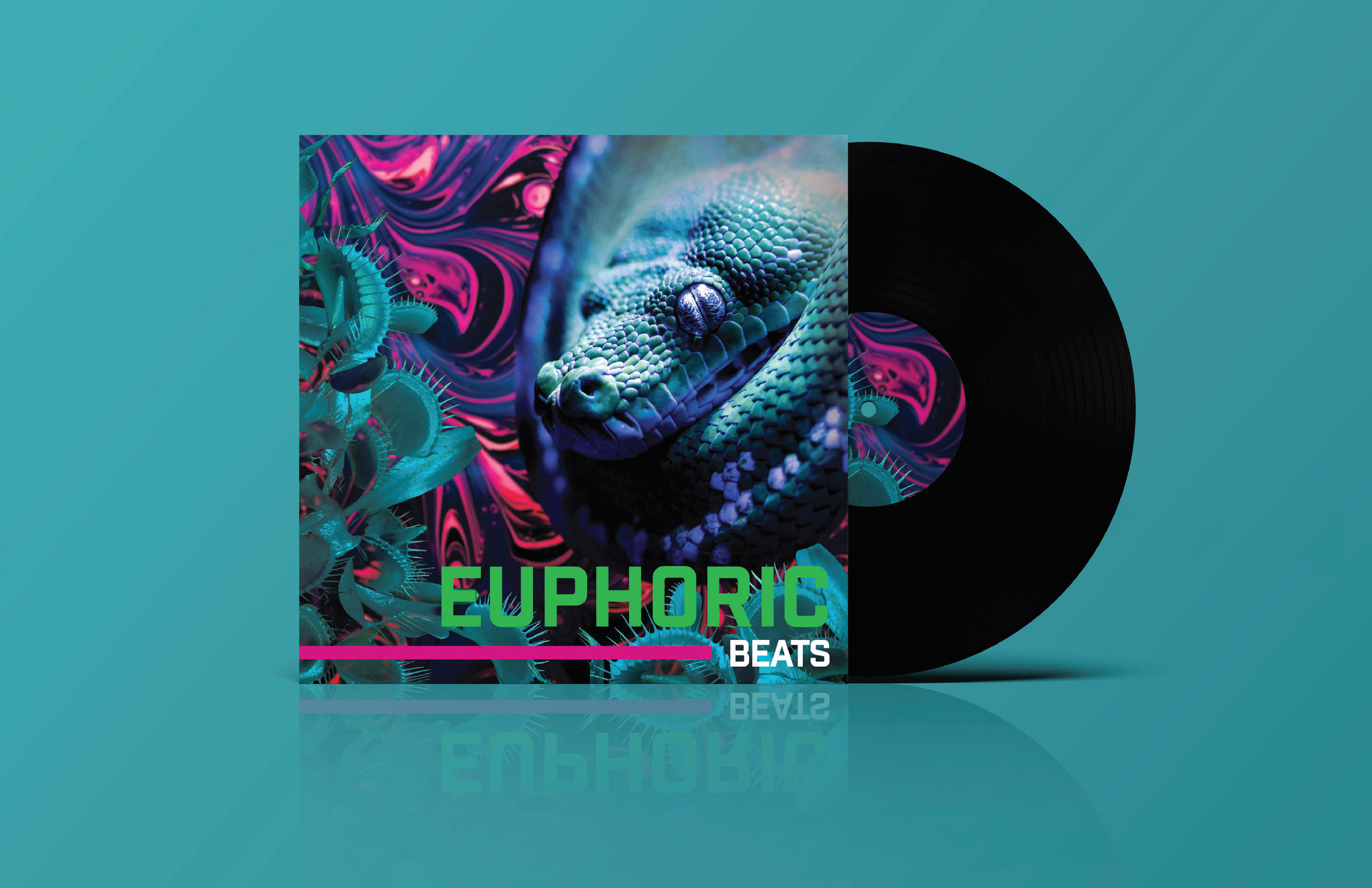
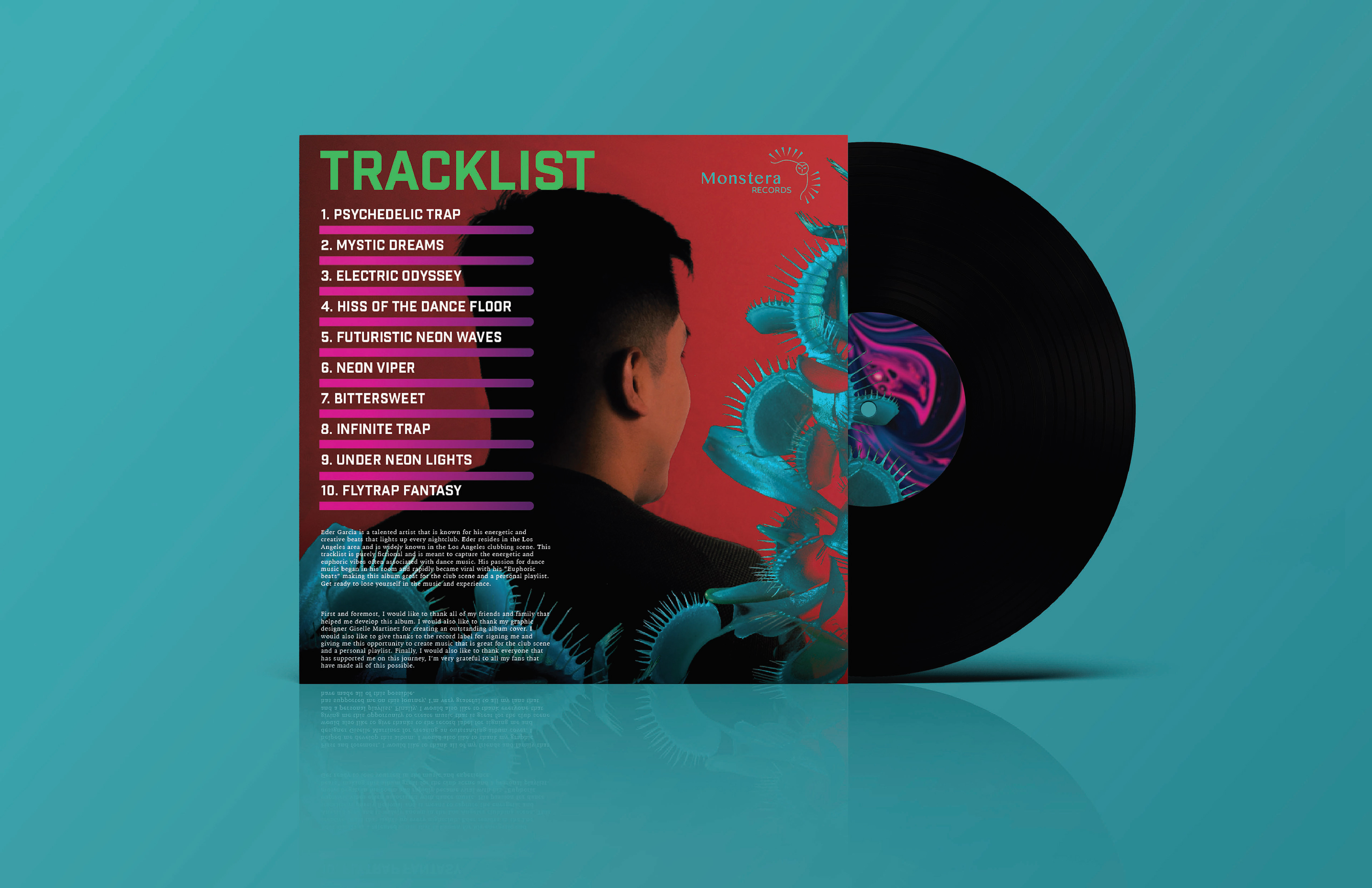
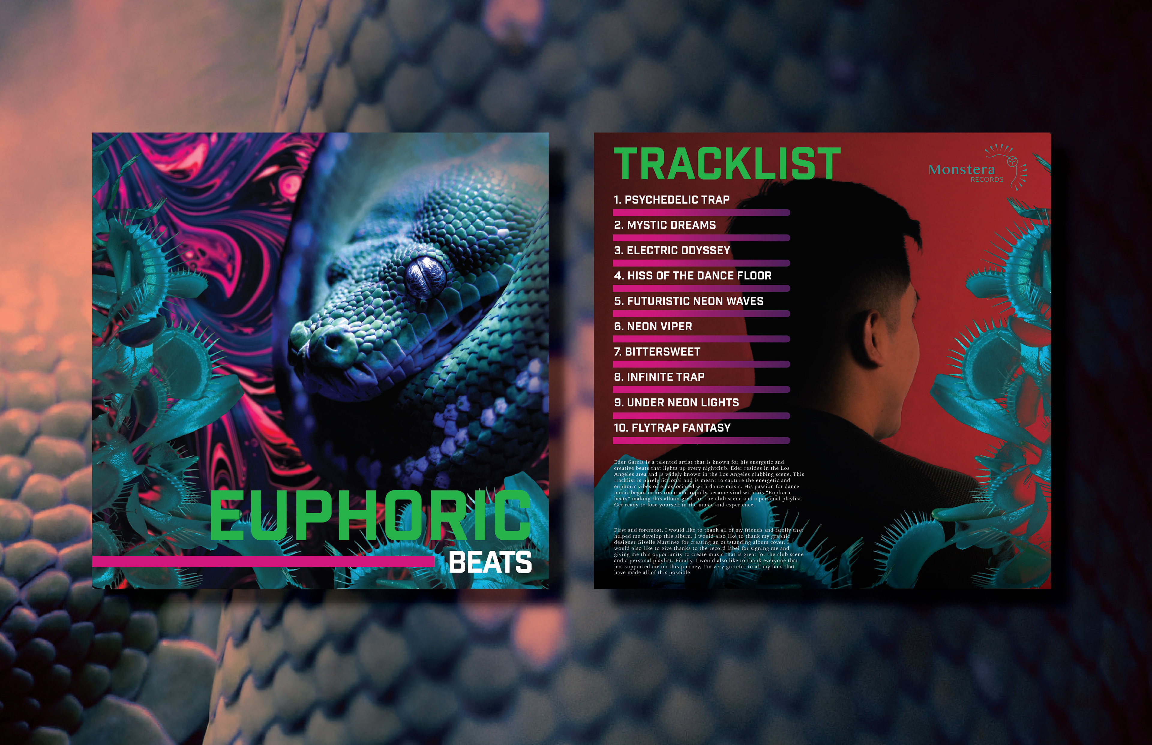
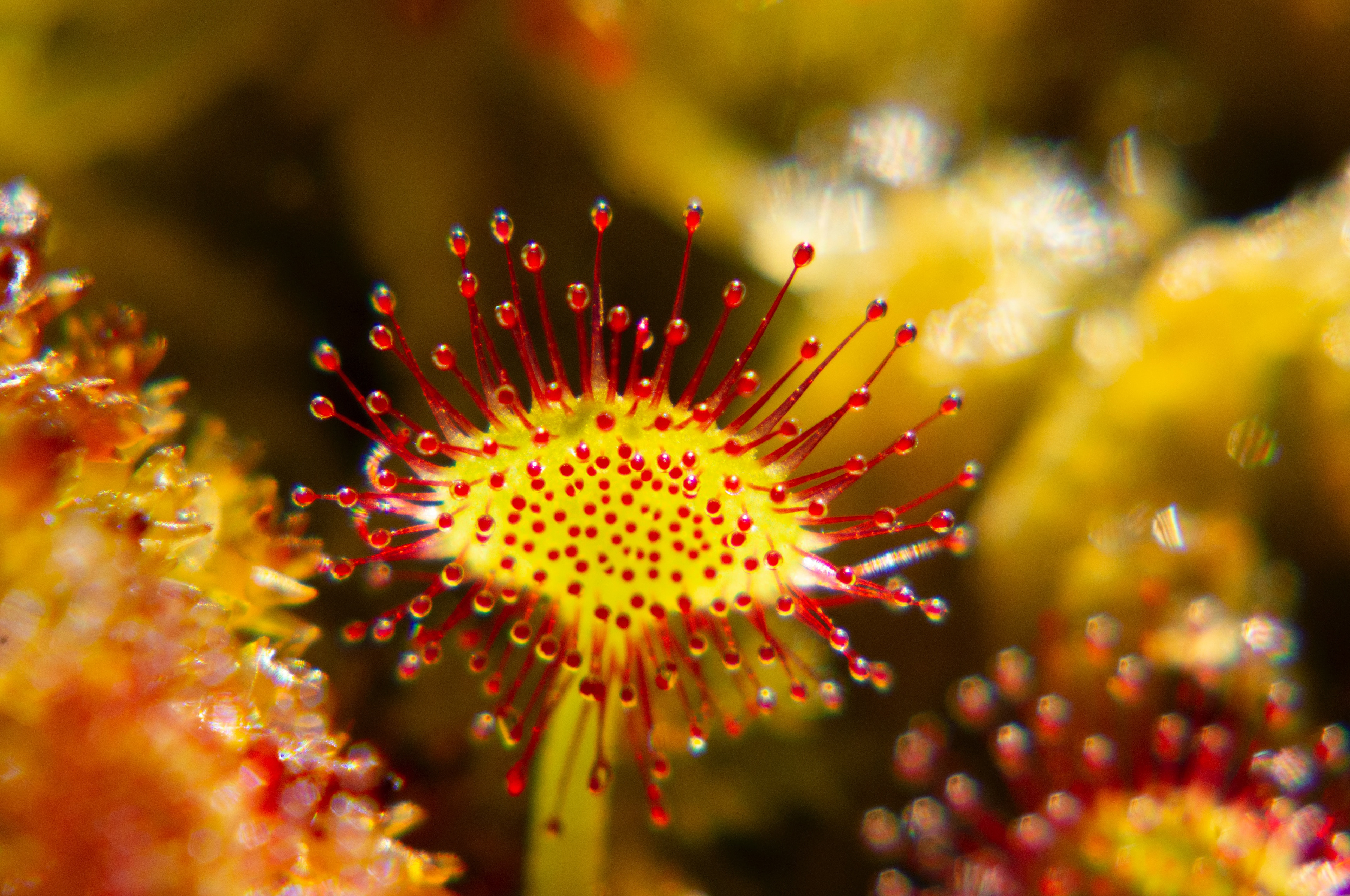
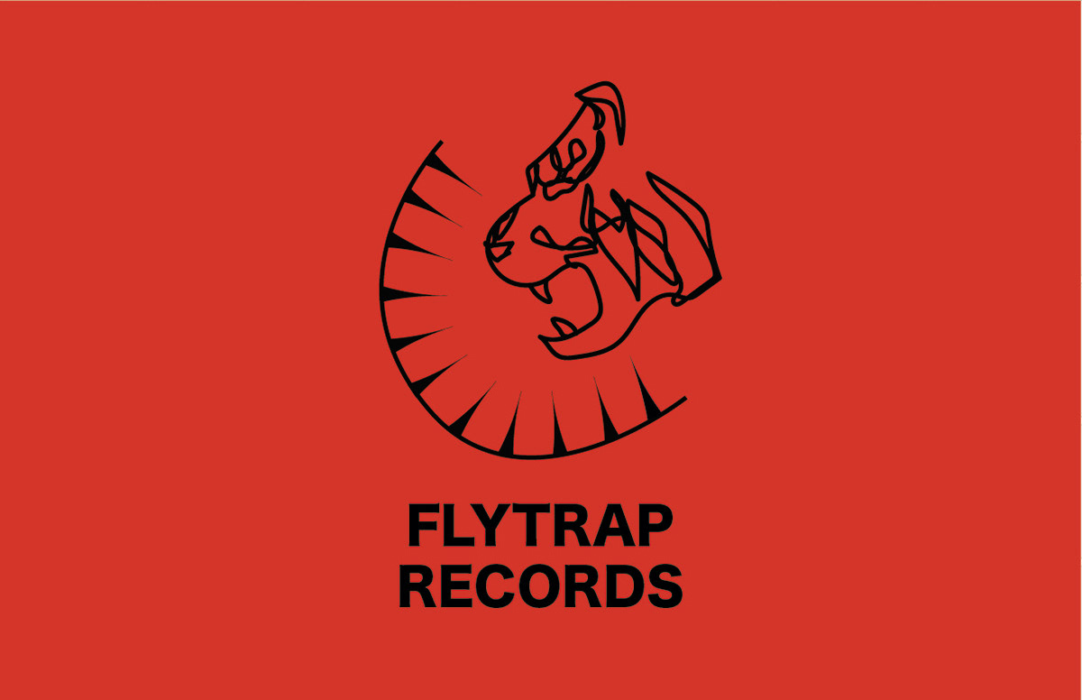
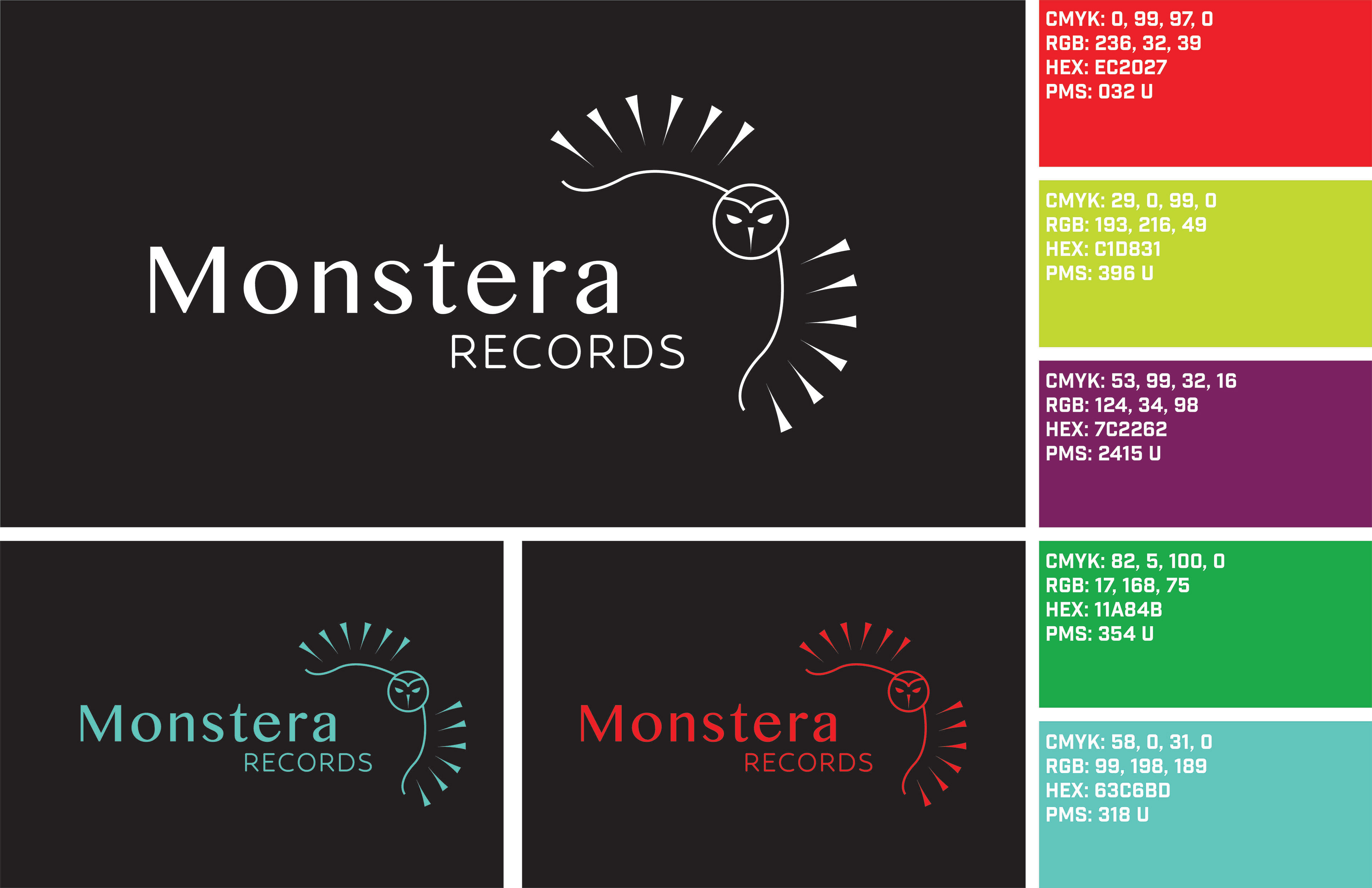
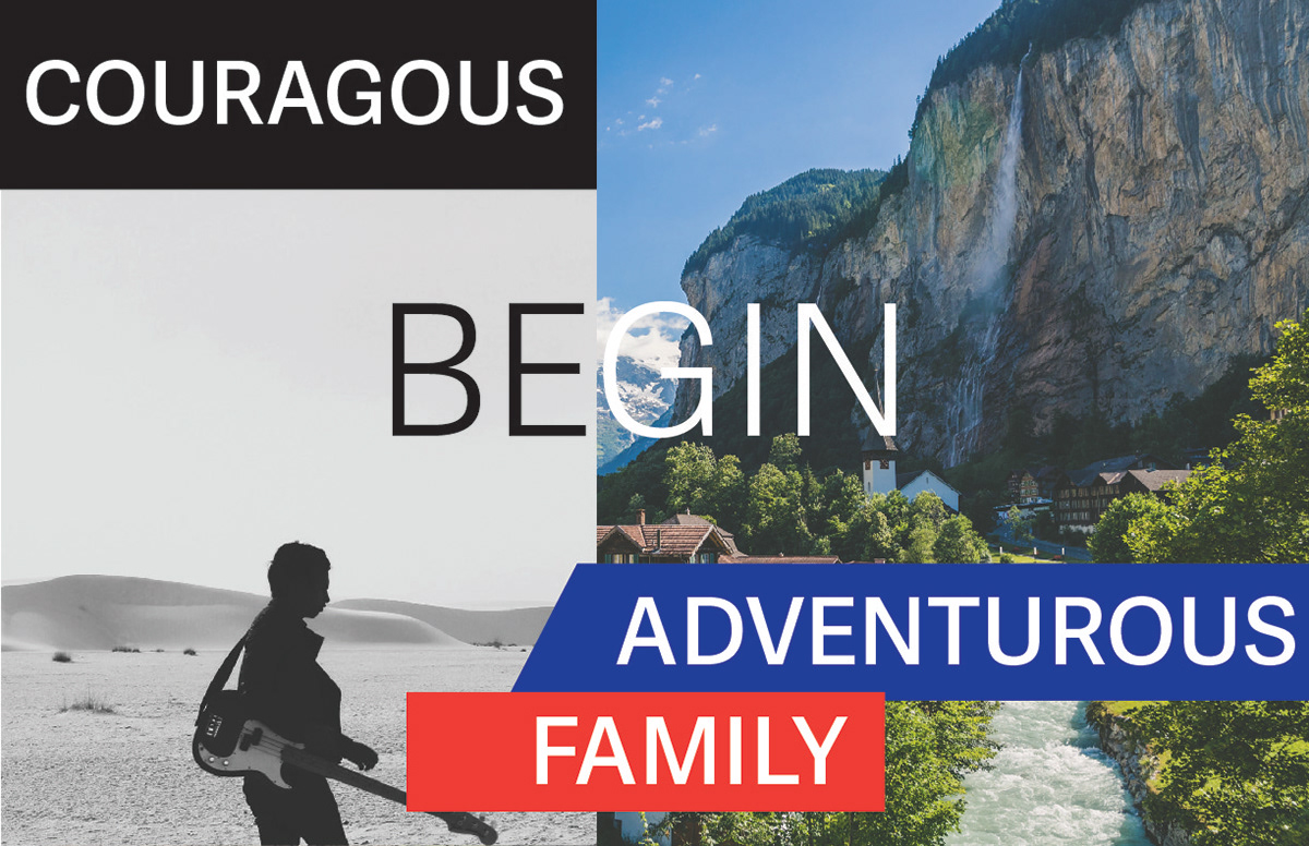
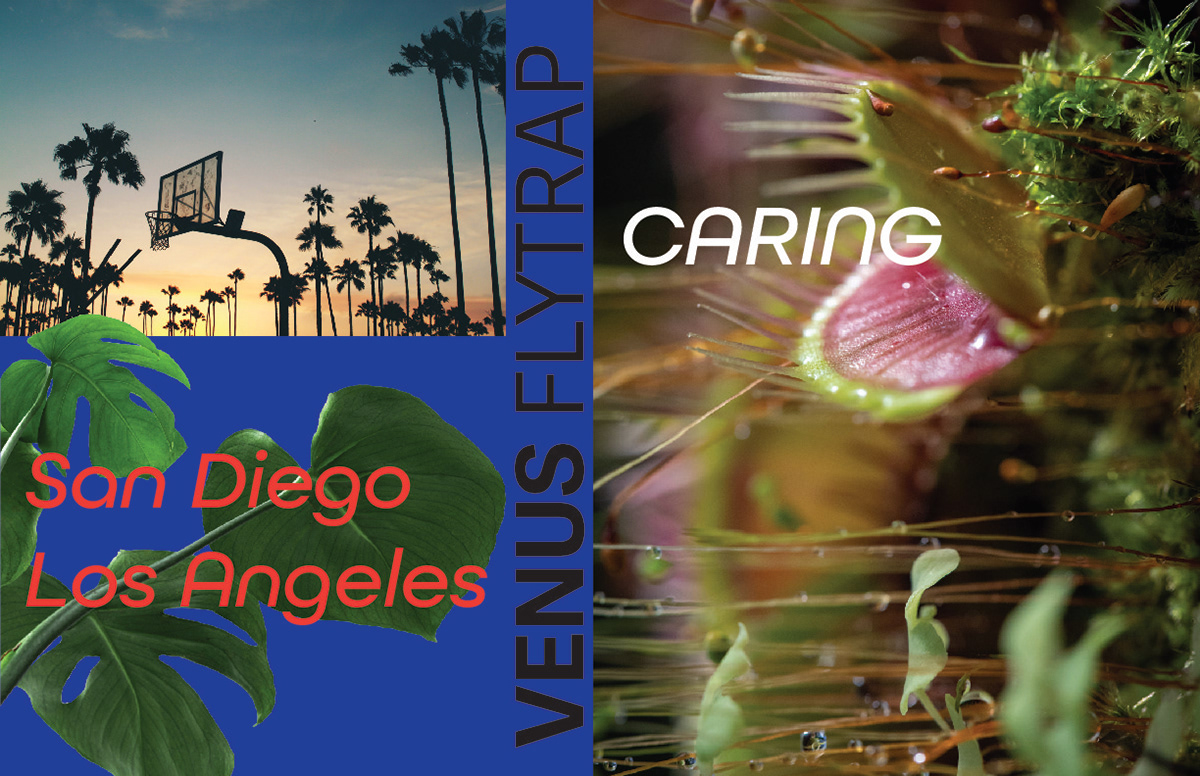
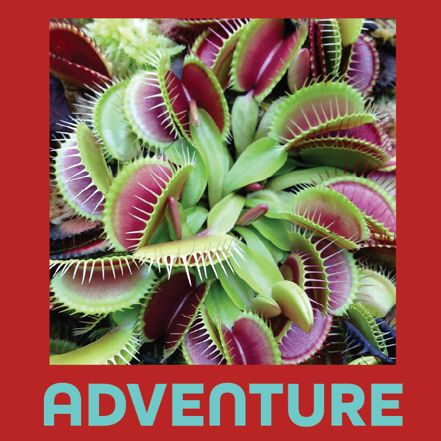
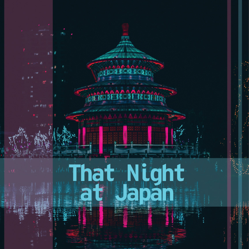
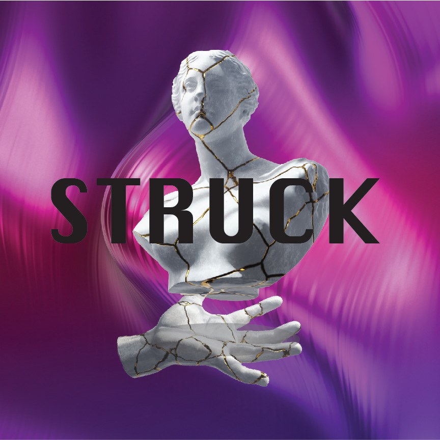
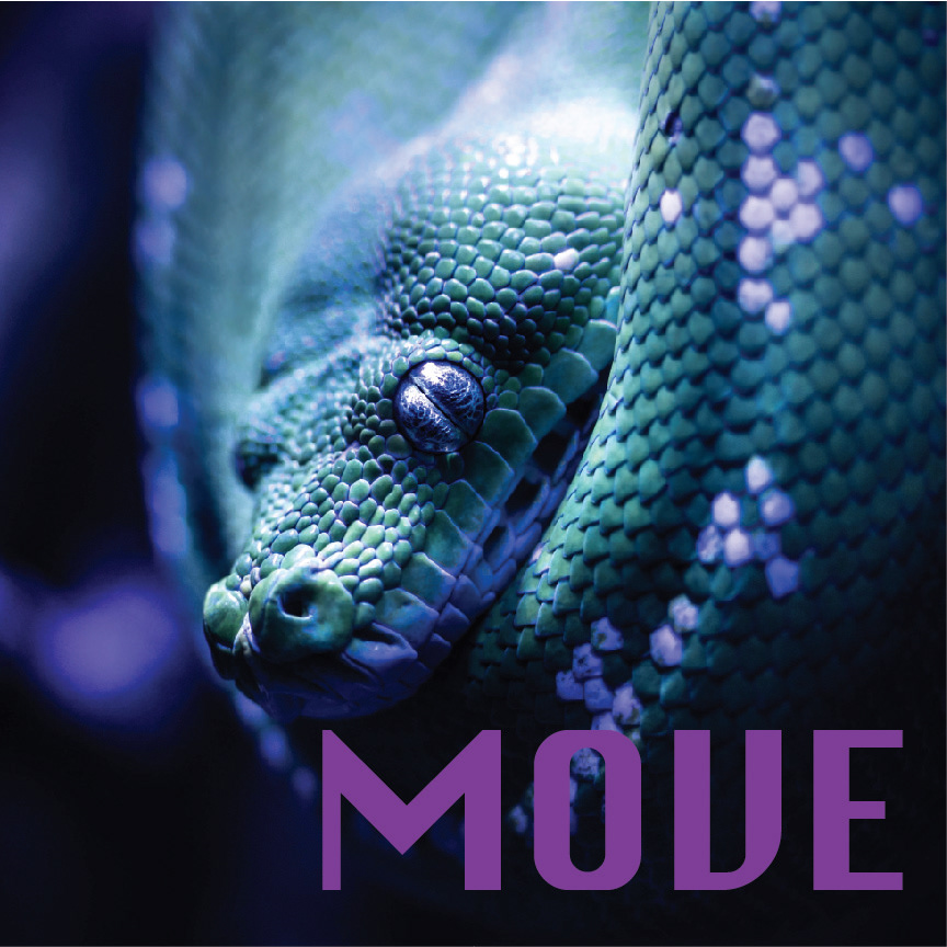
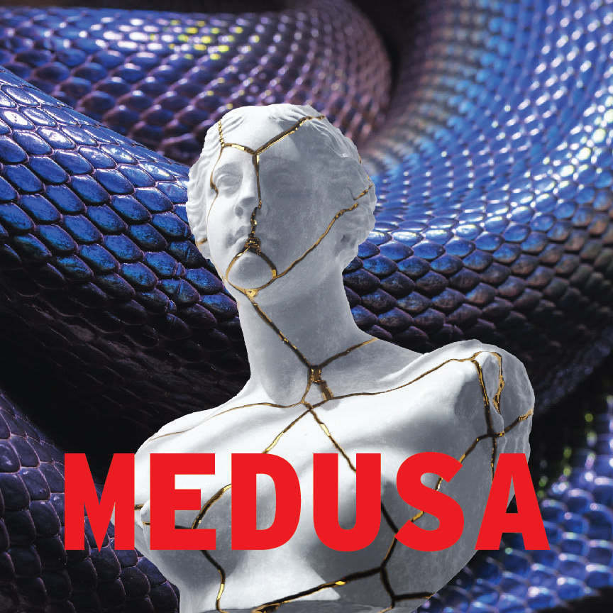
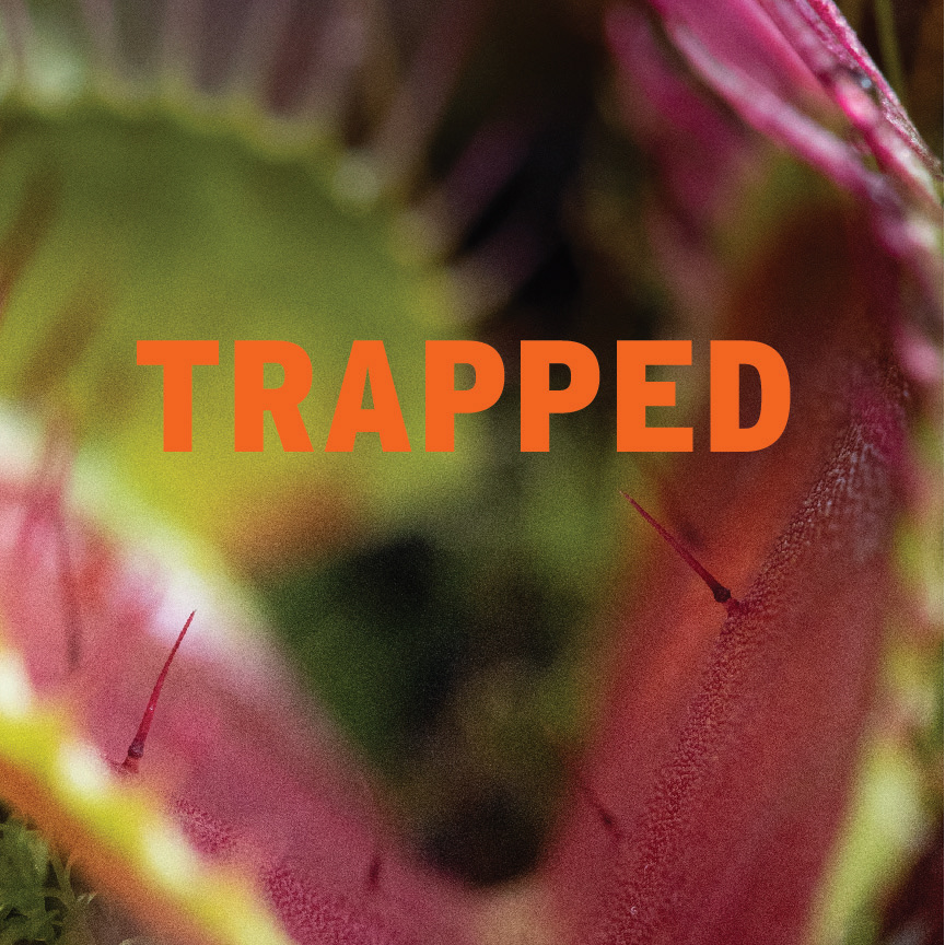
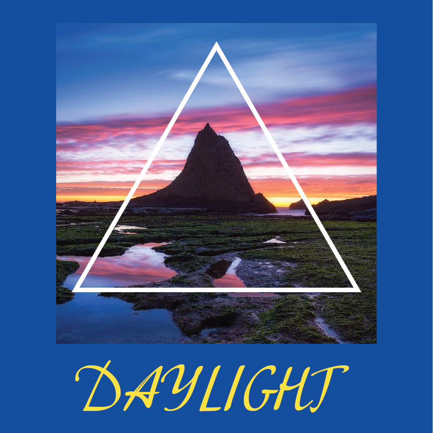
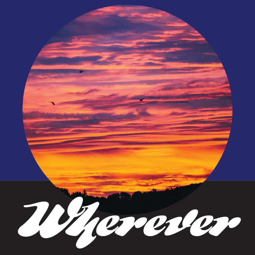
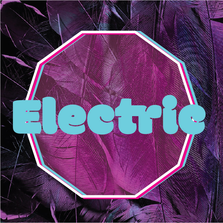
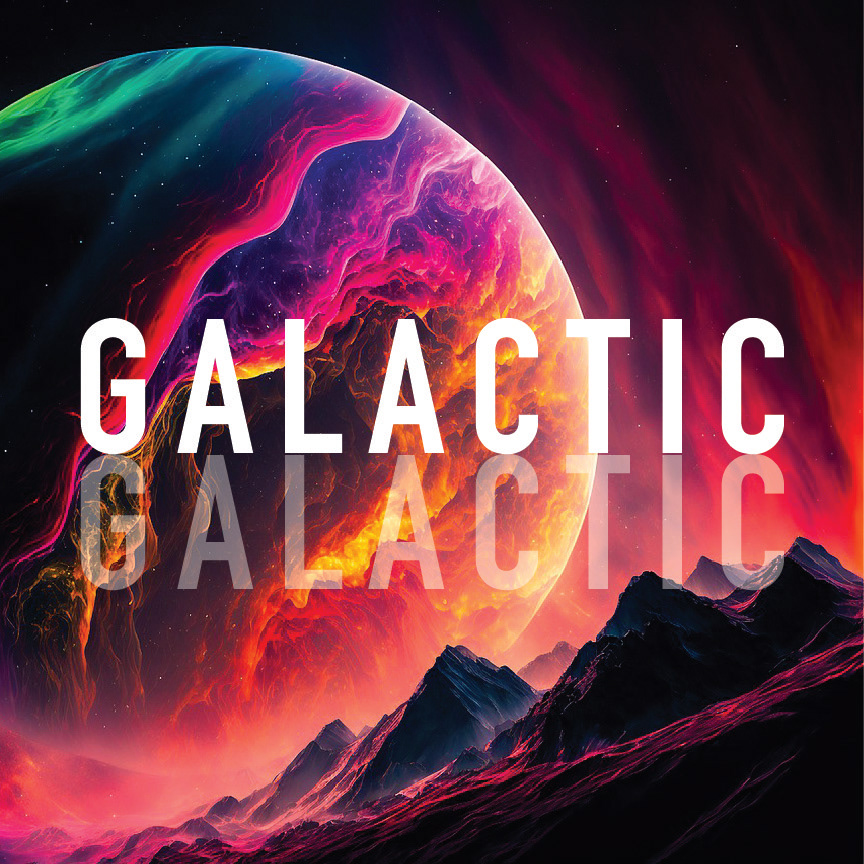
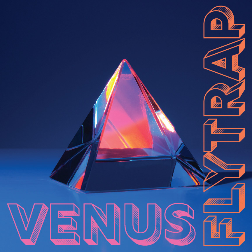
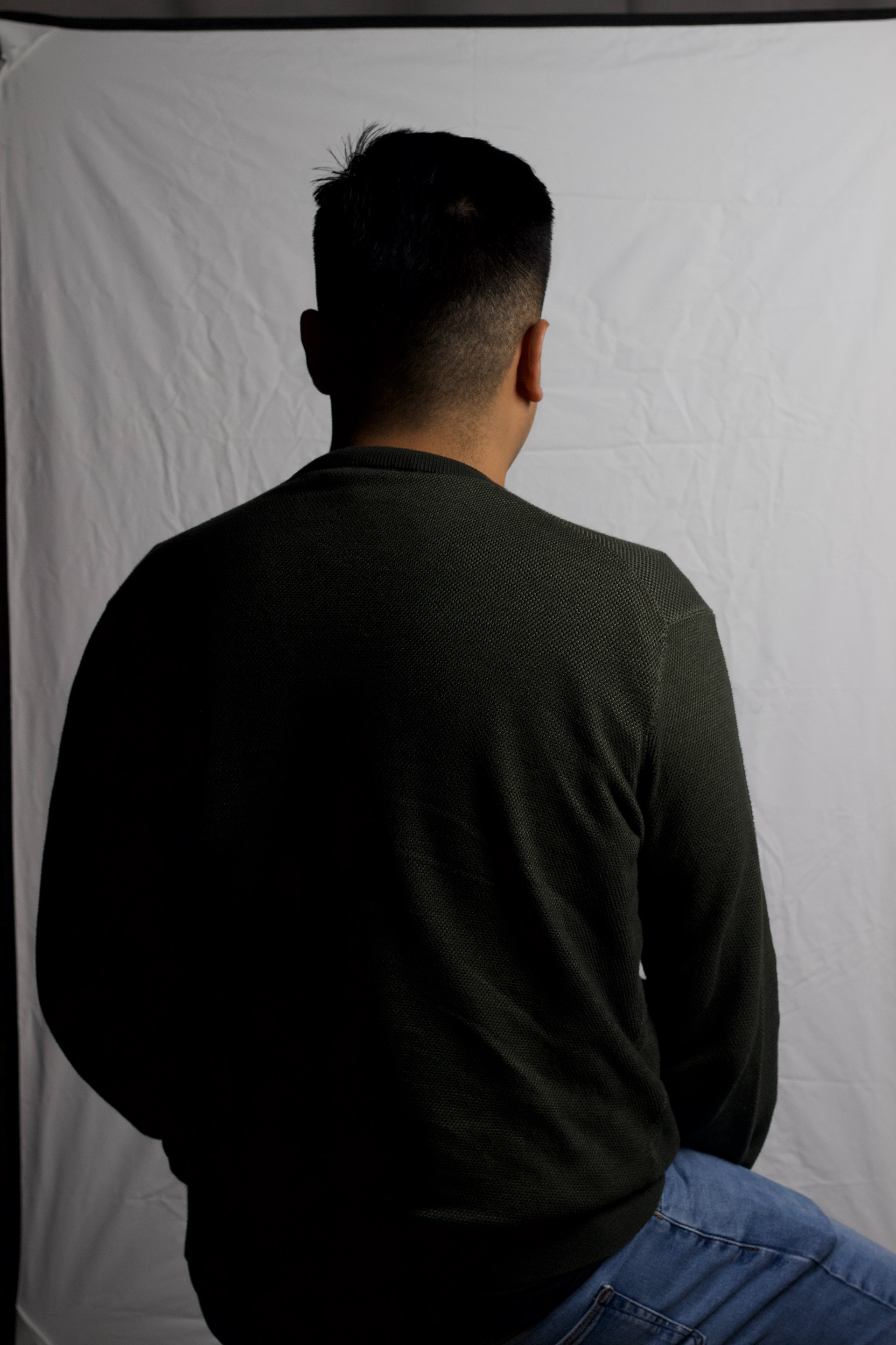
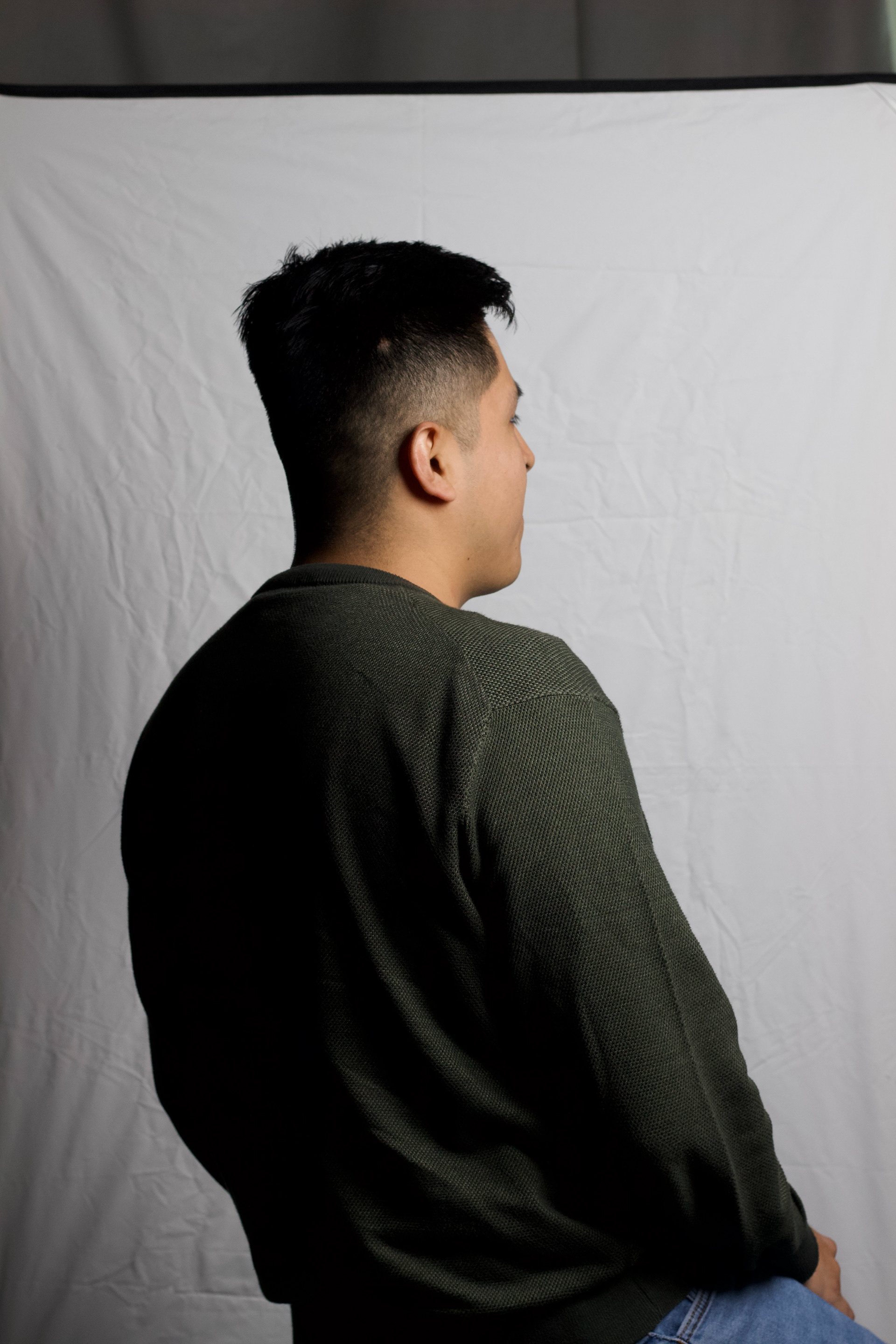
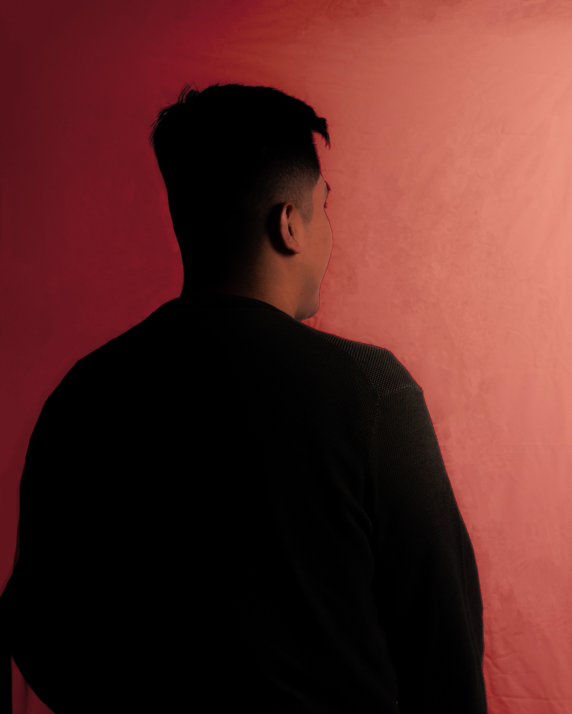
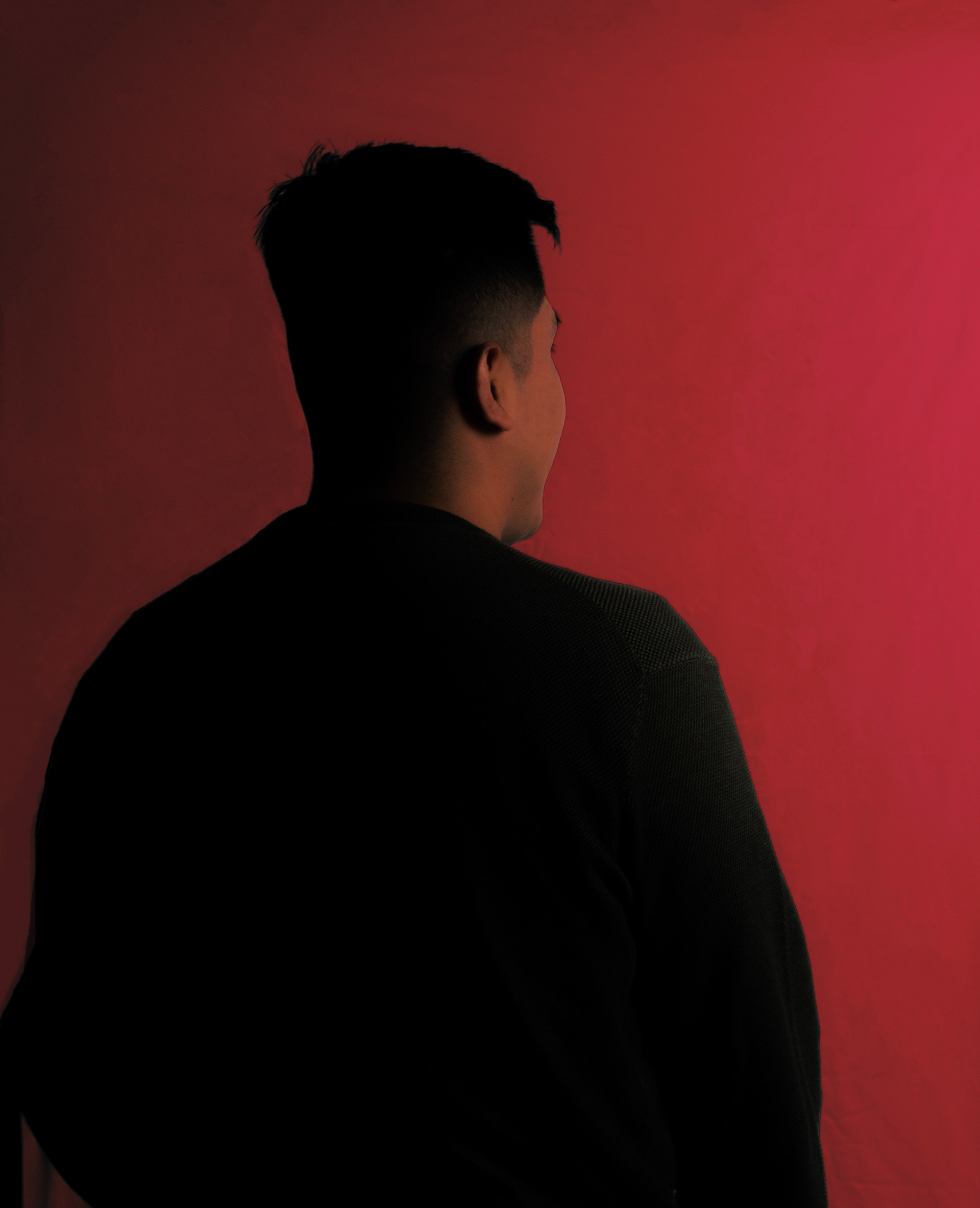
My client wanted bright colors, exotic animals, plants, and sunset colors. The album cover has a snake to represent the exotic animals he likes and venus flytraps, as he has taken care of the carnivorous plant in the past. My client was not fond of having his portrait taken, so we collectively decided that a silhouette of him would work, for the album's back cover and with his comfort level.
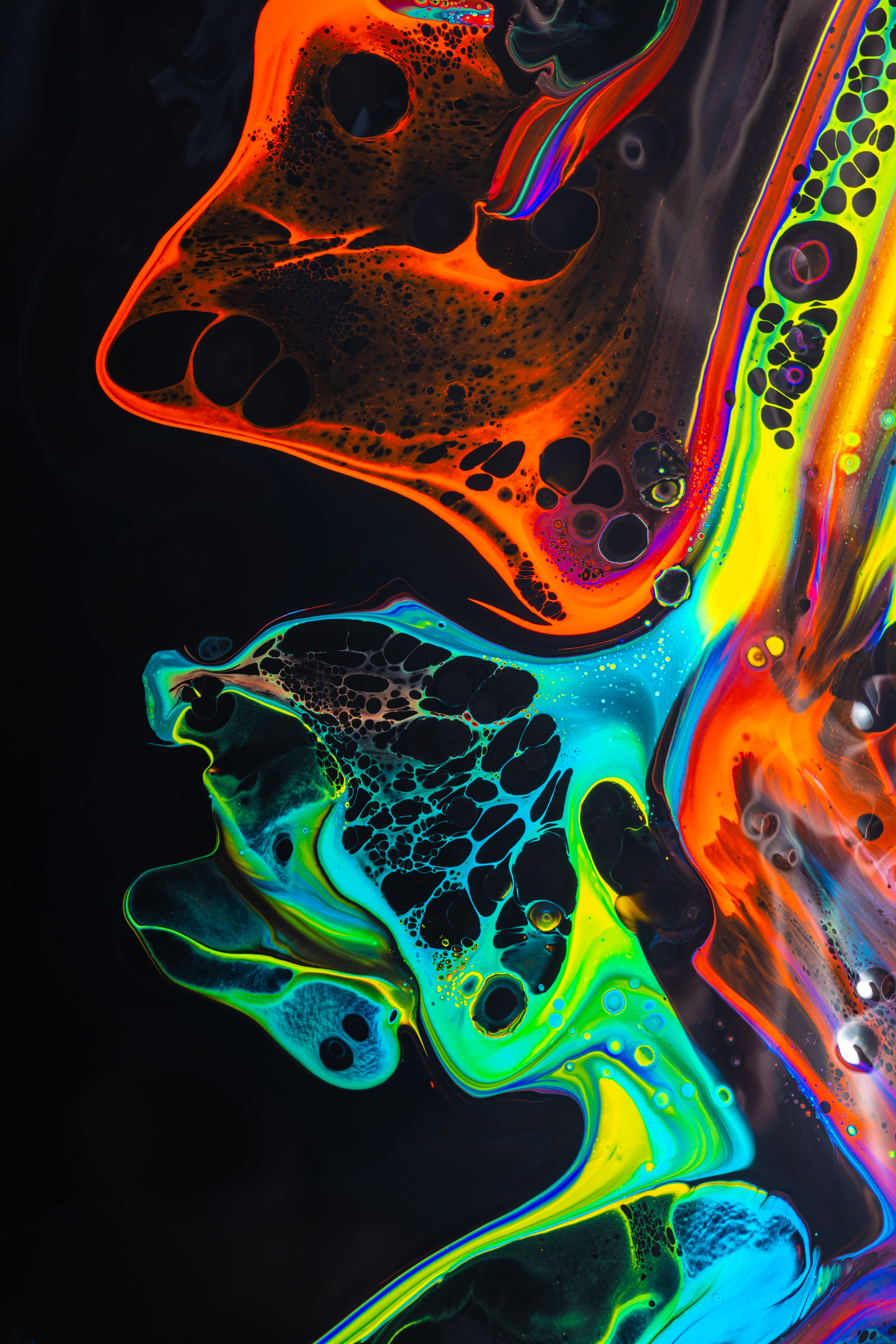
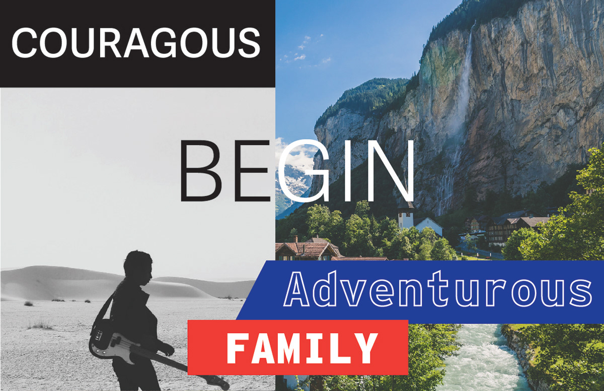
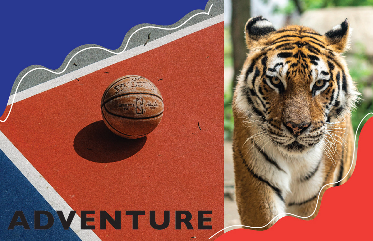
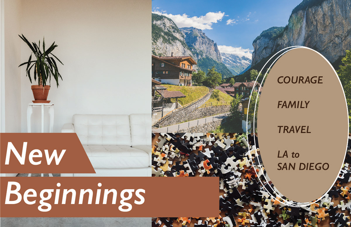
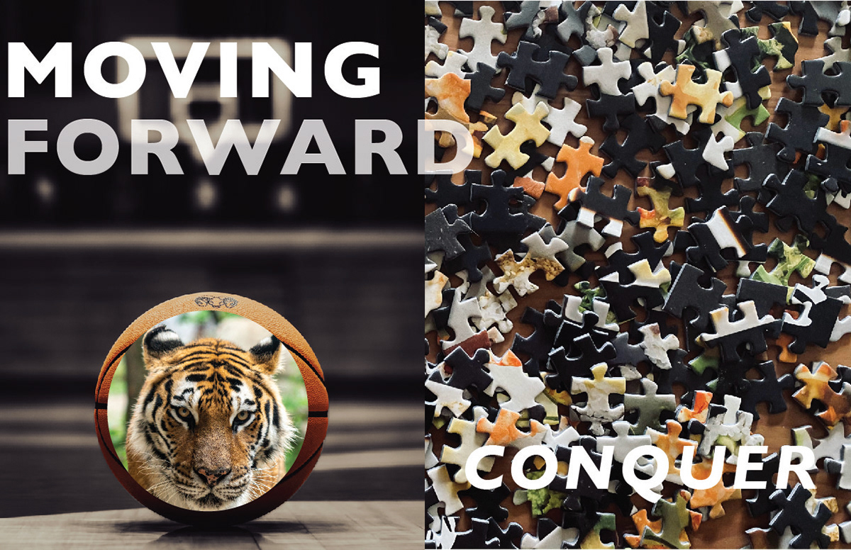
Moodboard
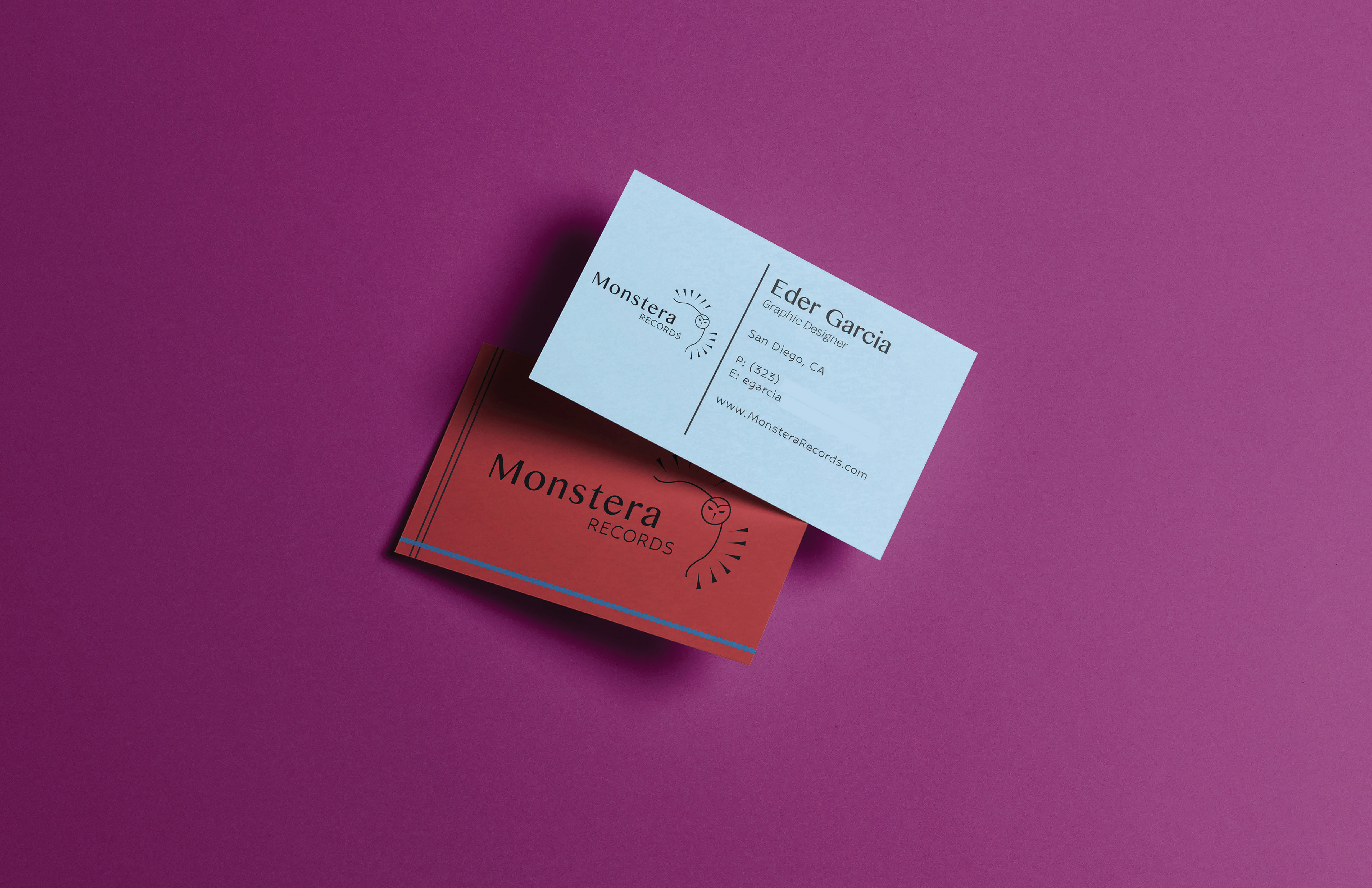
Business Card
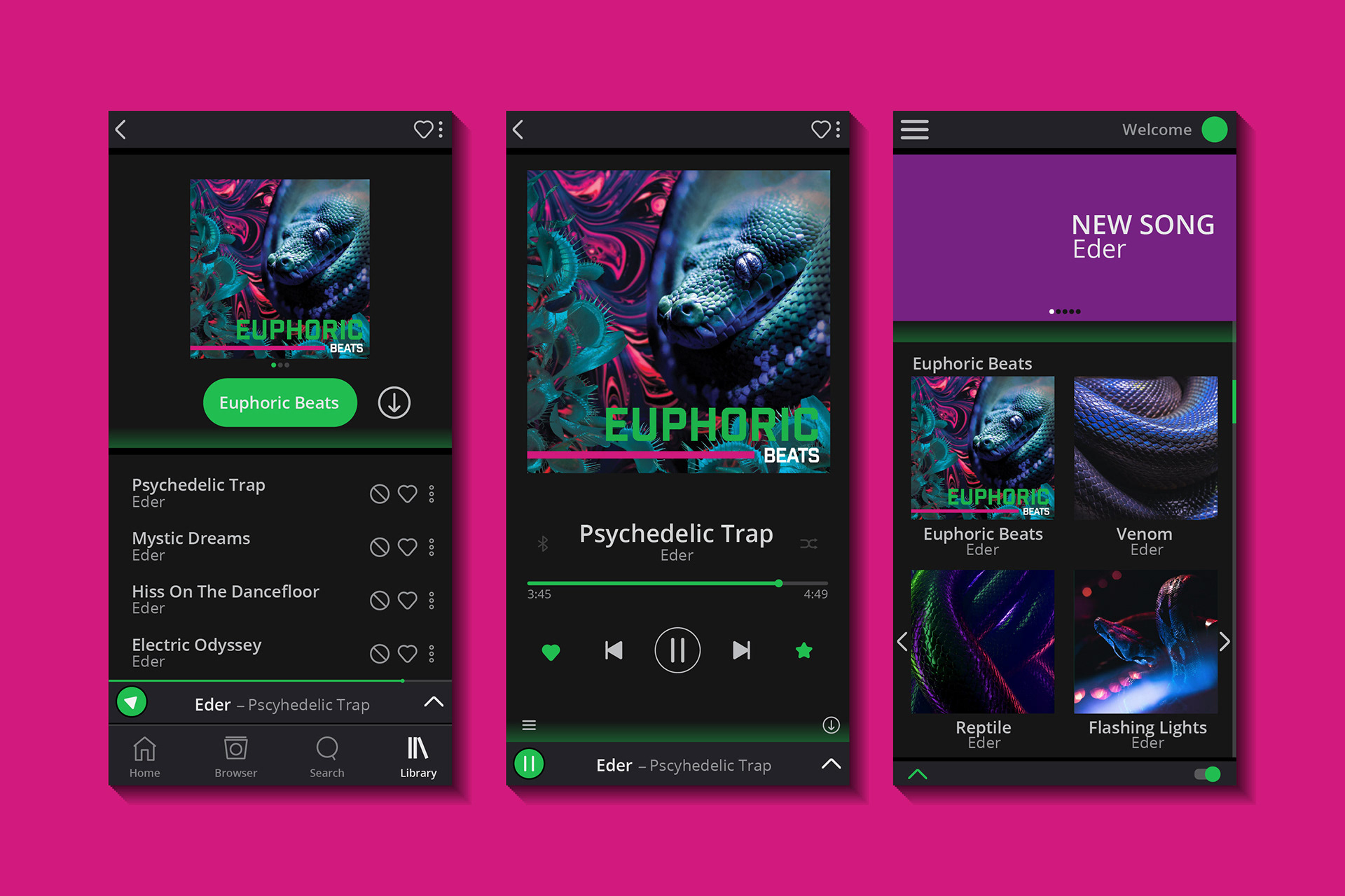
App
Concept 1
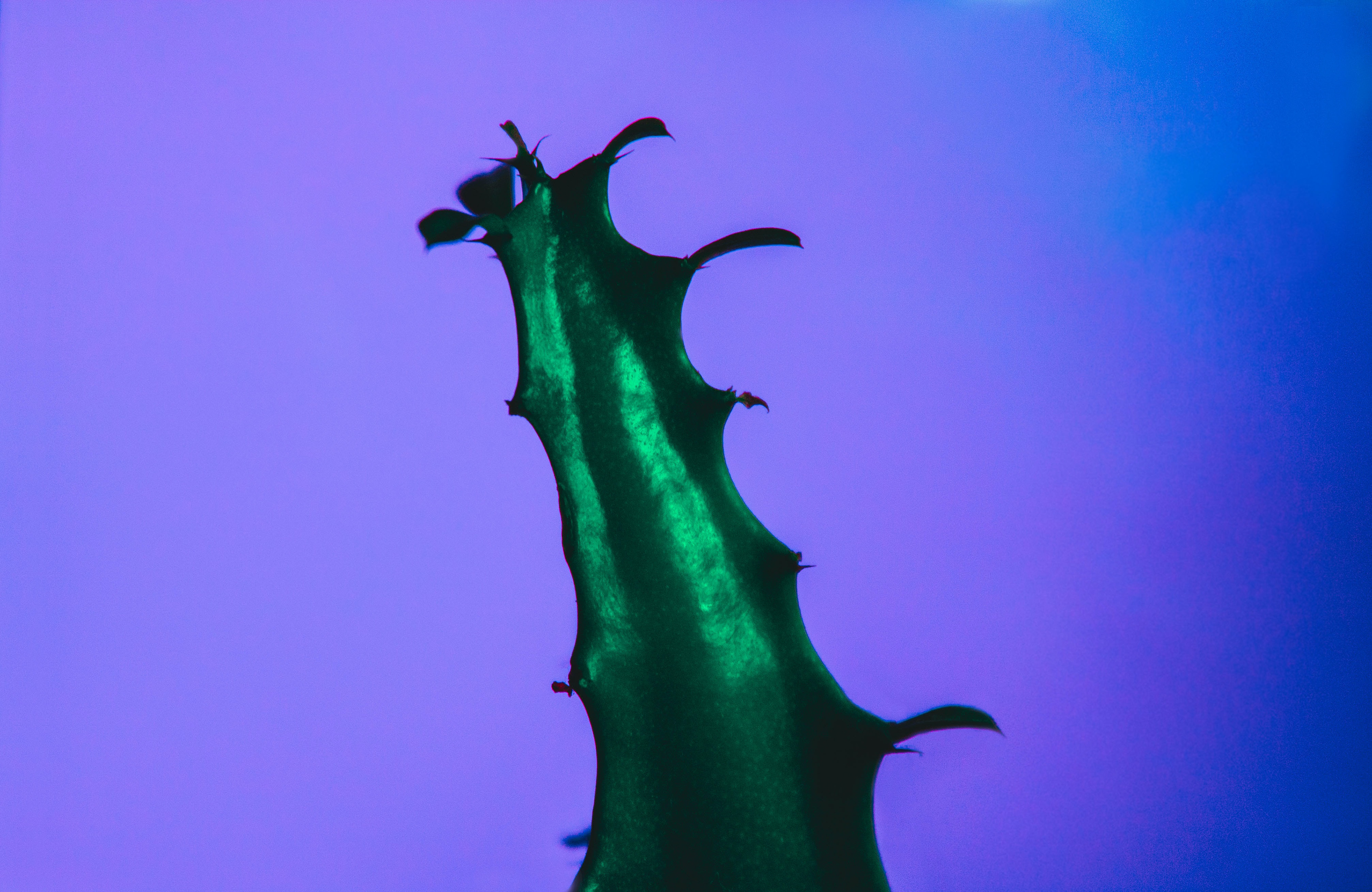
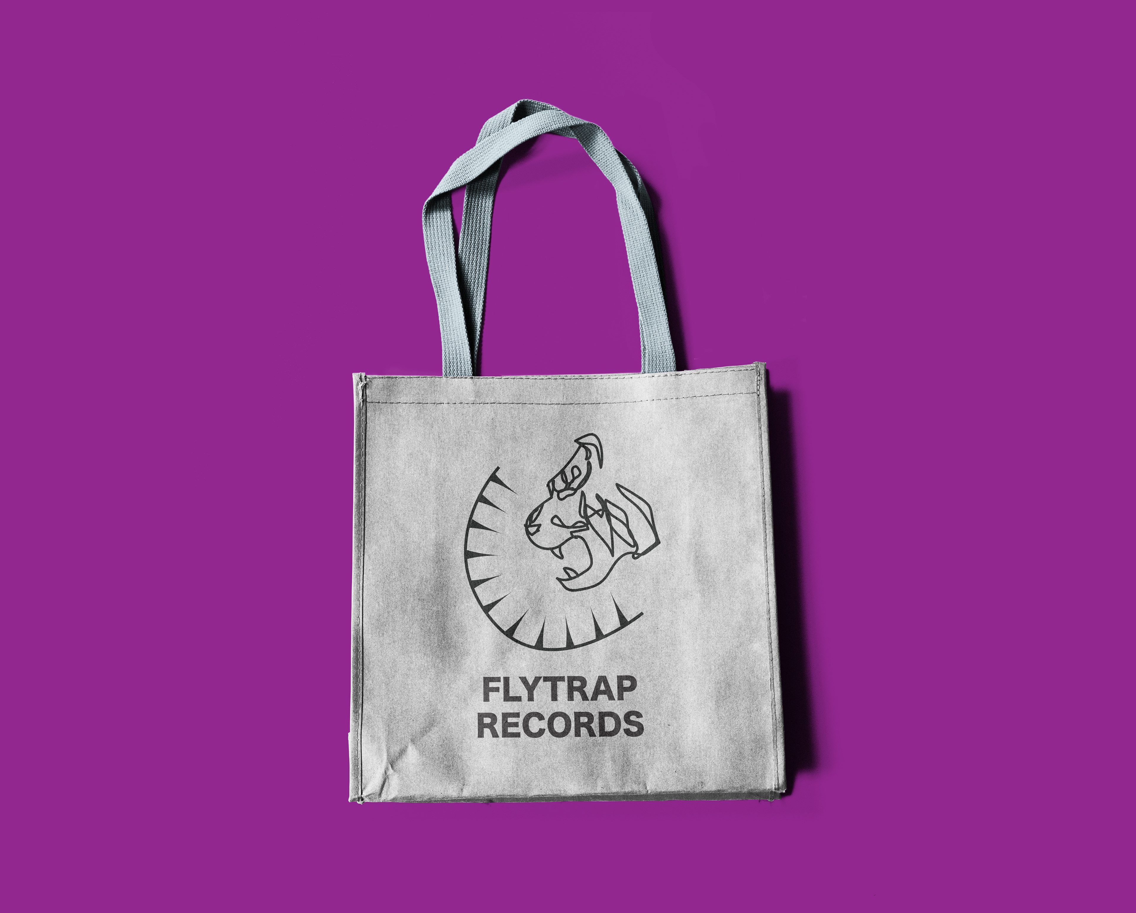
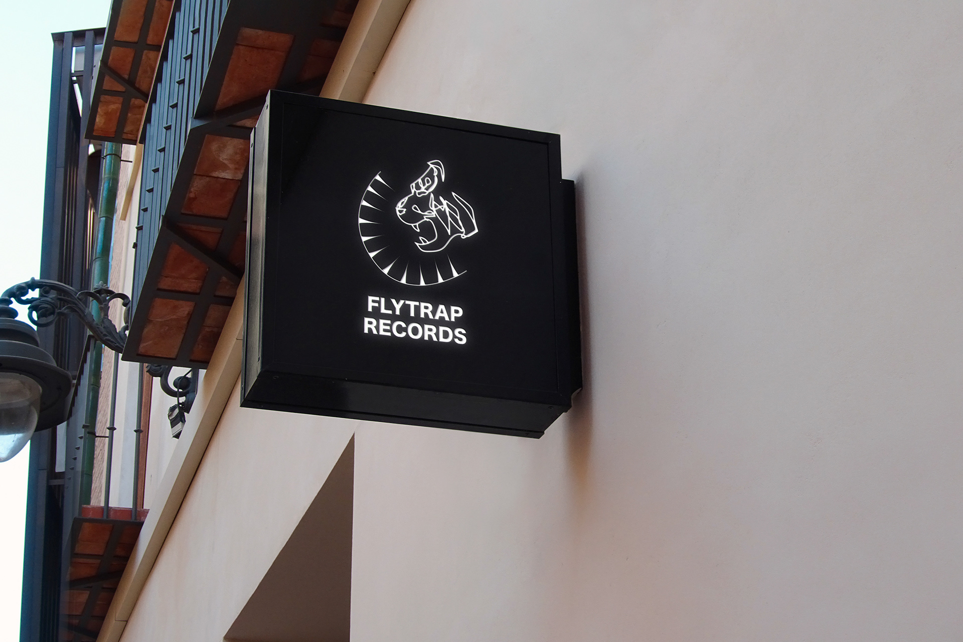
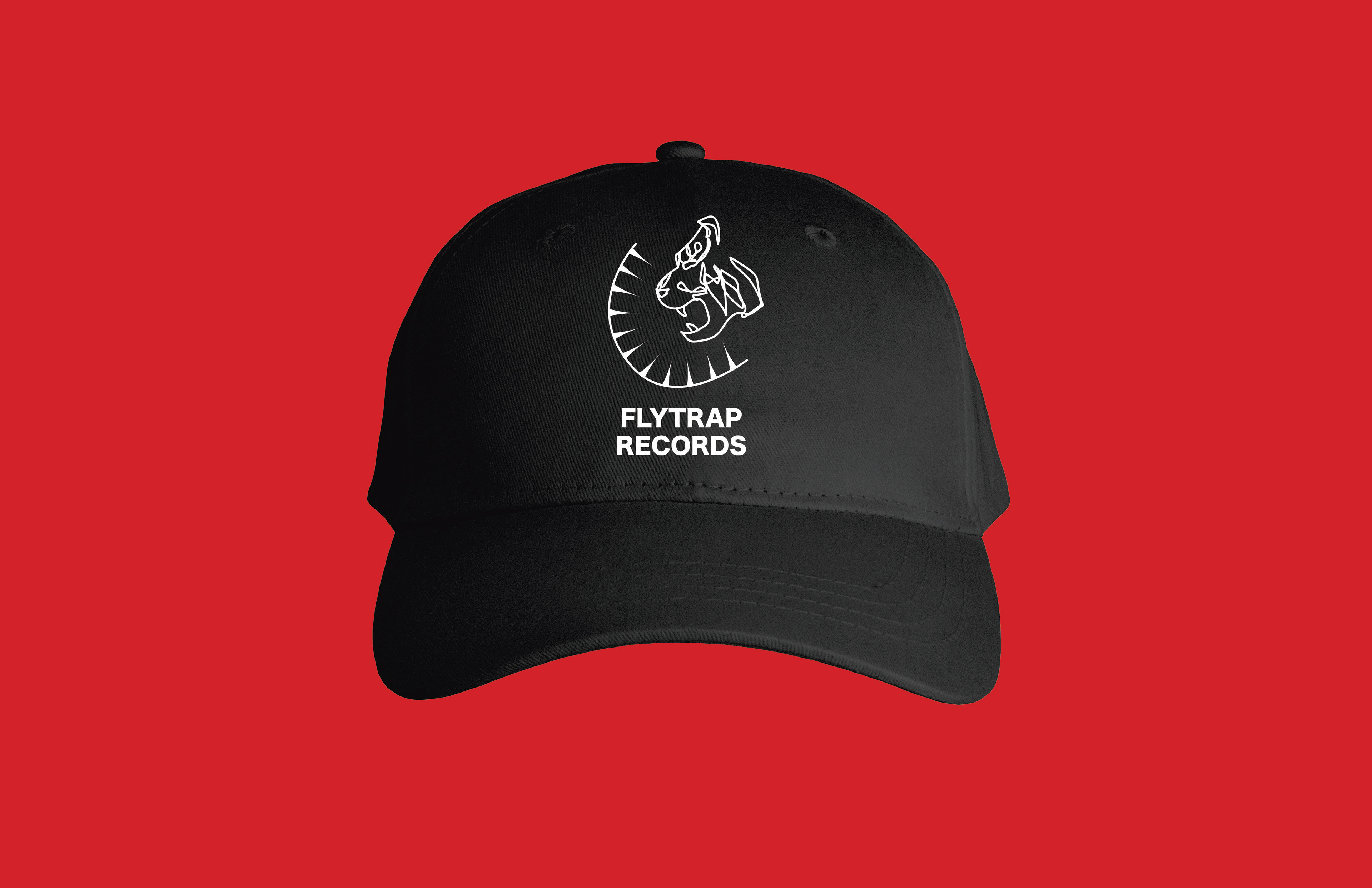
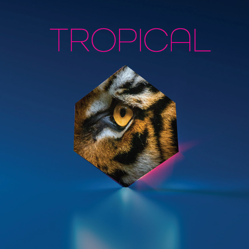
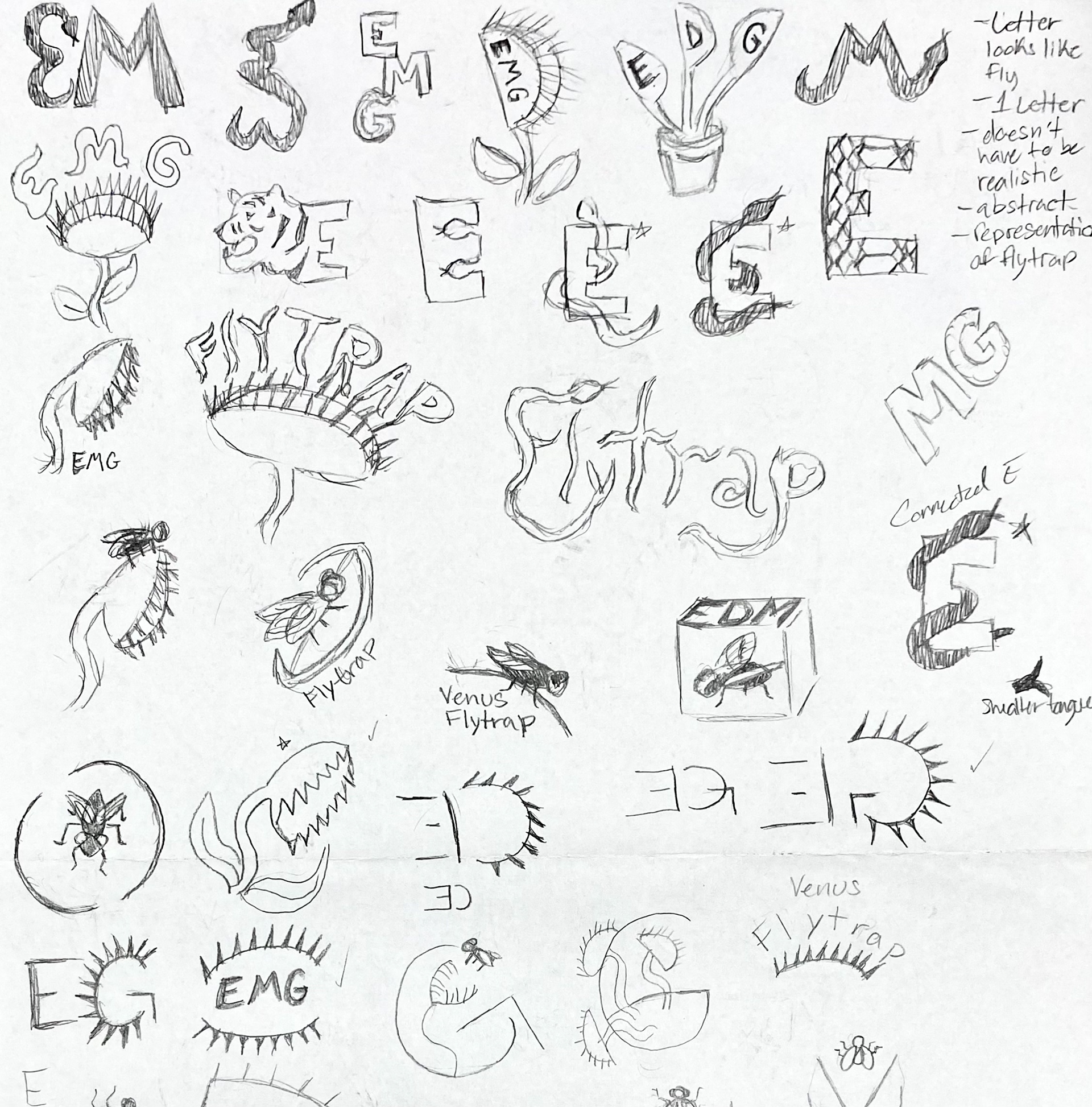
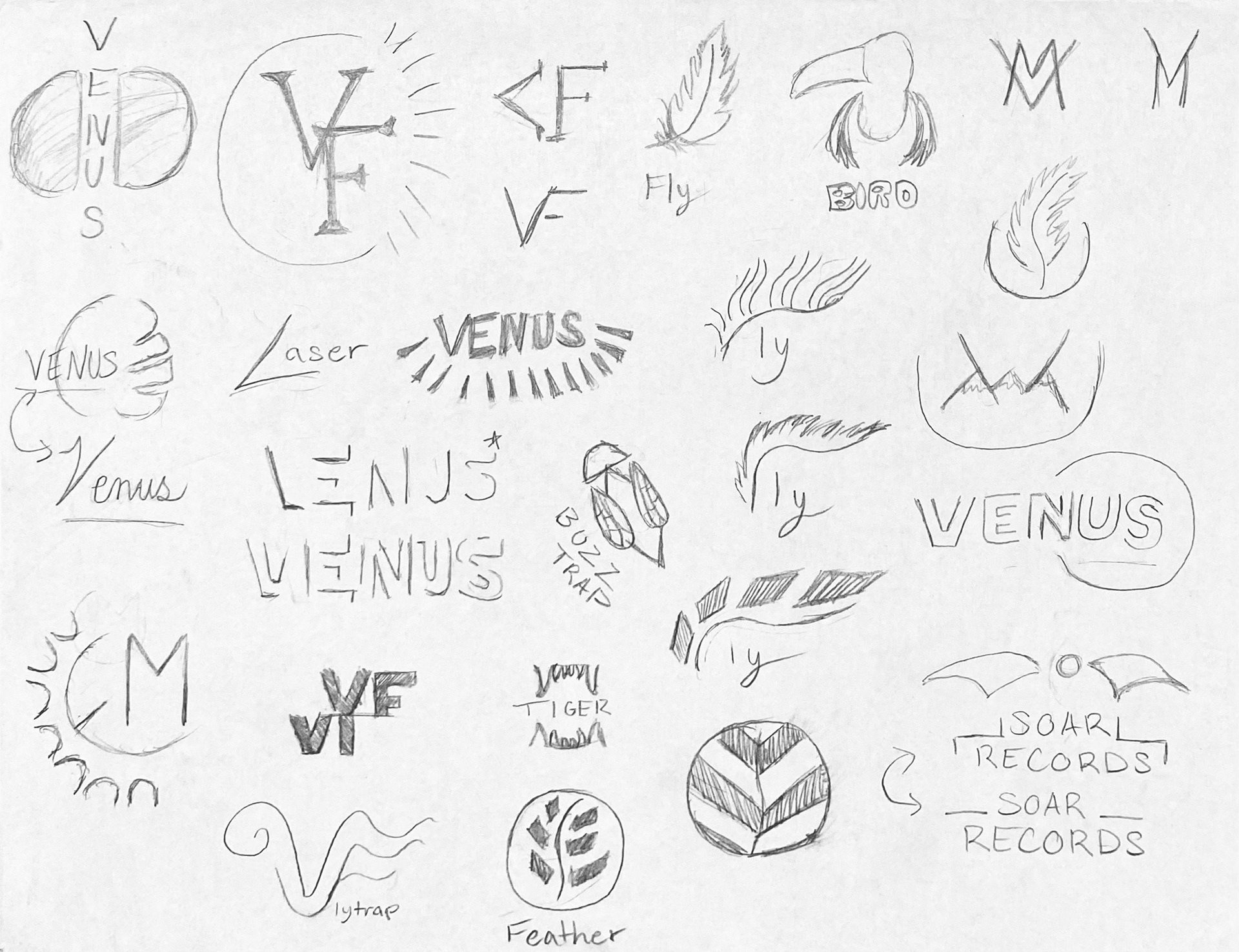
First Concept includes the client’s interest of tigers and plants for a representational visual identity for my client. My client has mentioned liking the plant venus flytraps, which became something to consistently implement into my designs. The spikes take place as the spikes on a venus flytrap.
Concept 2
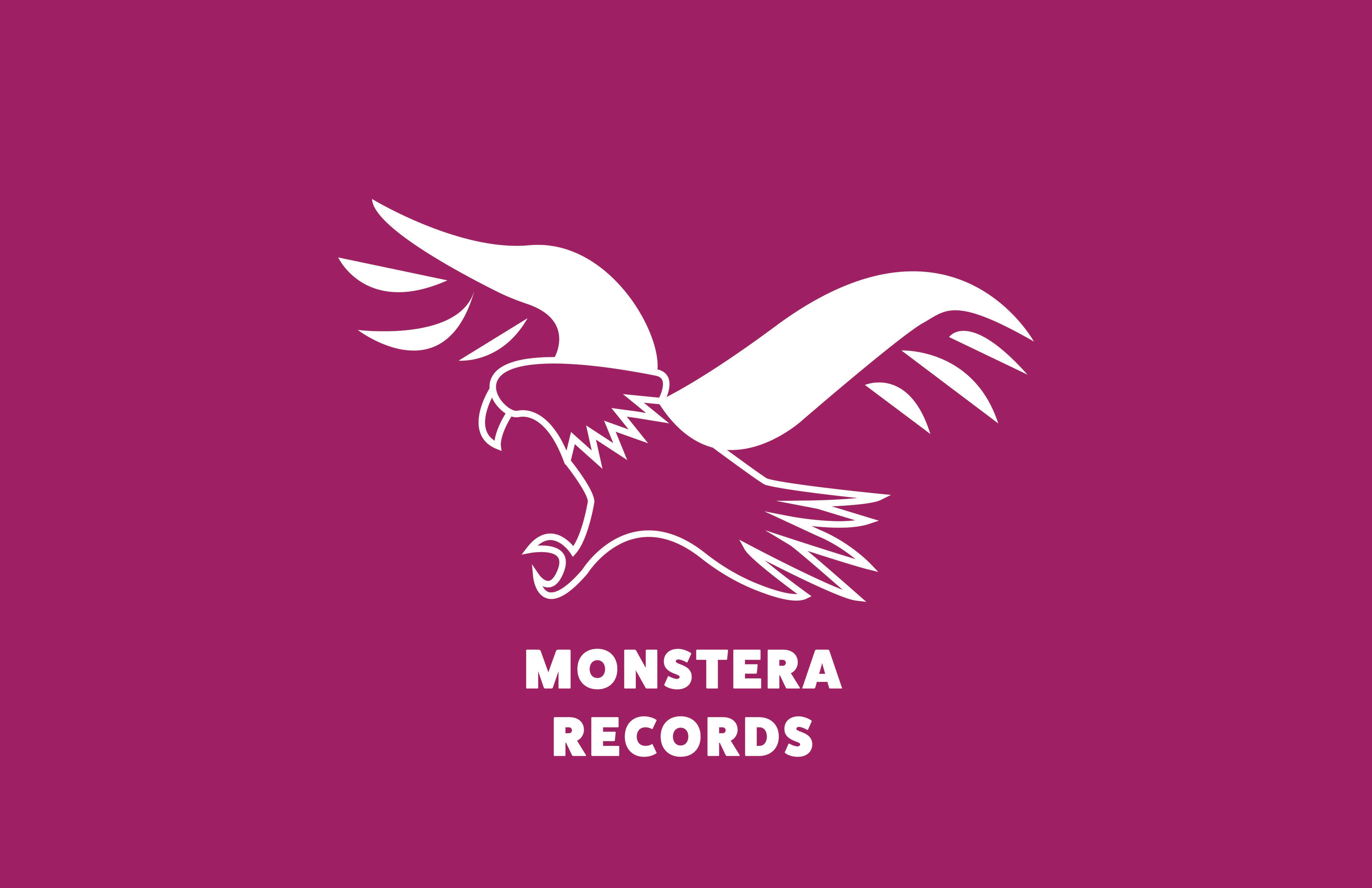
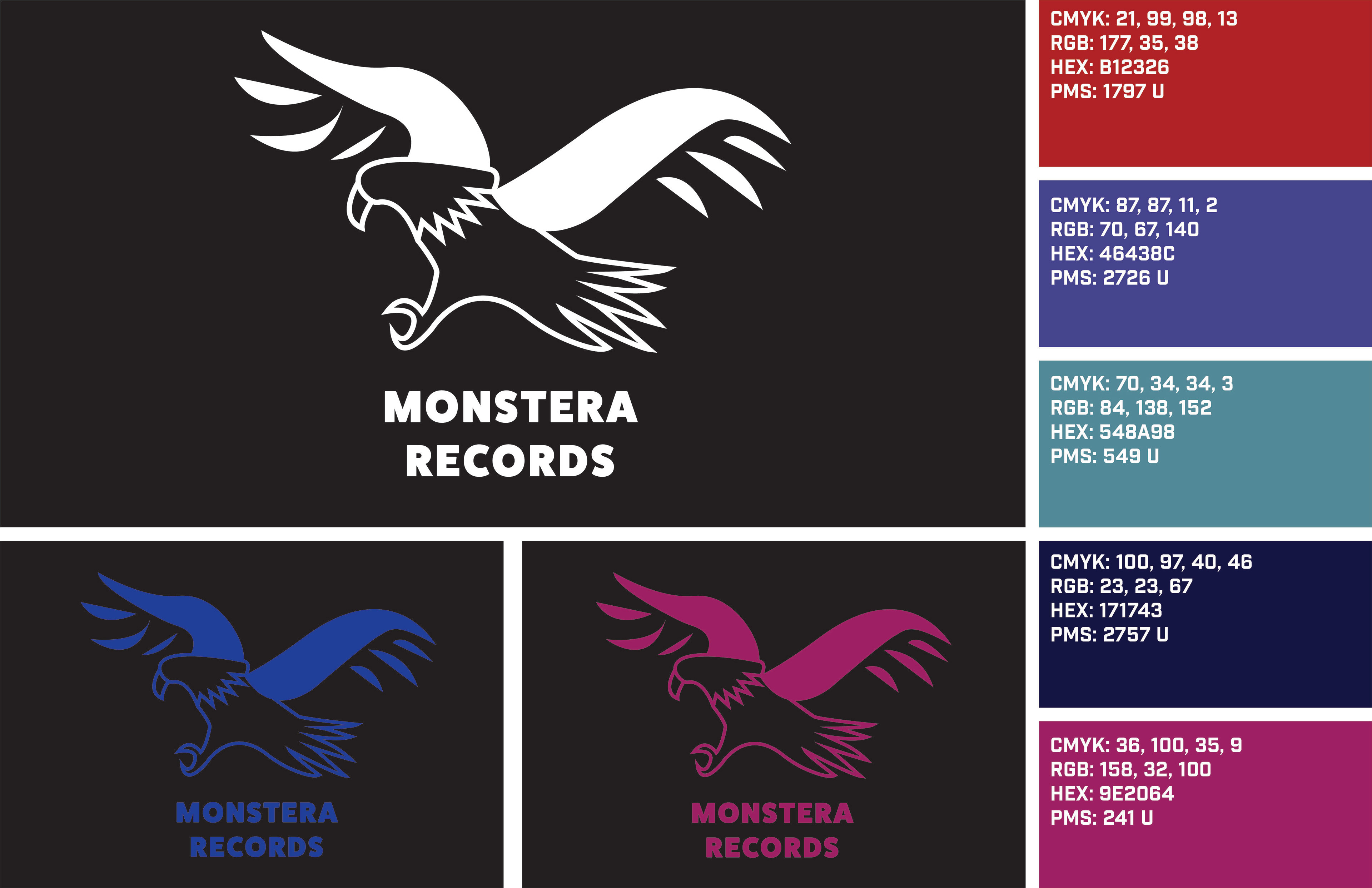
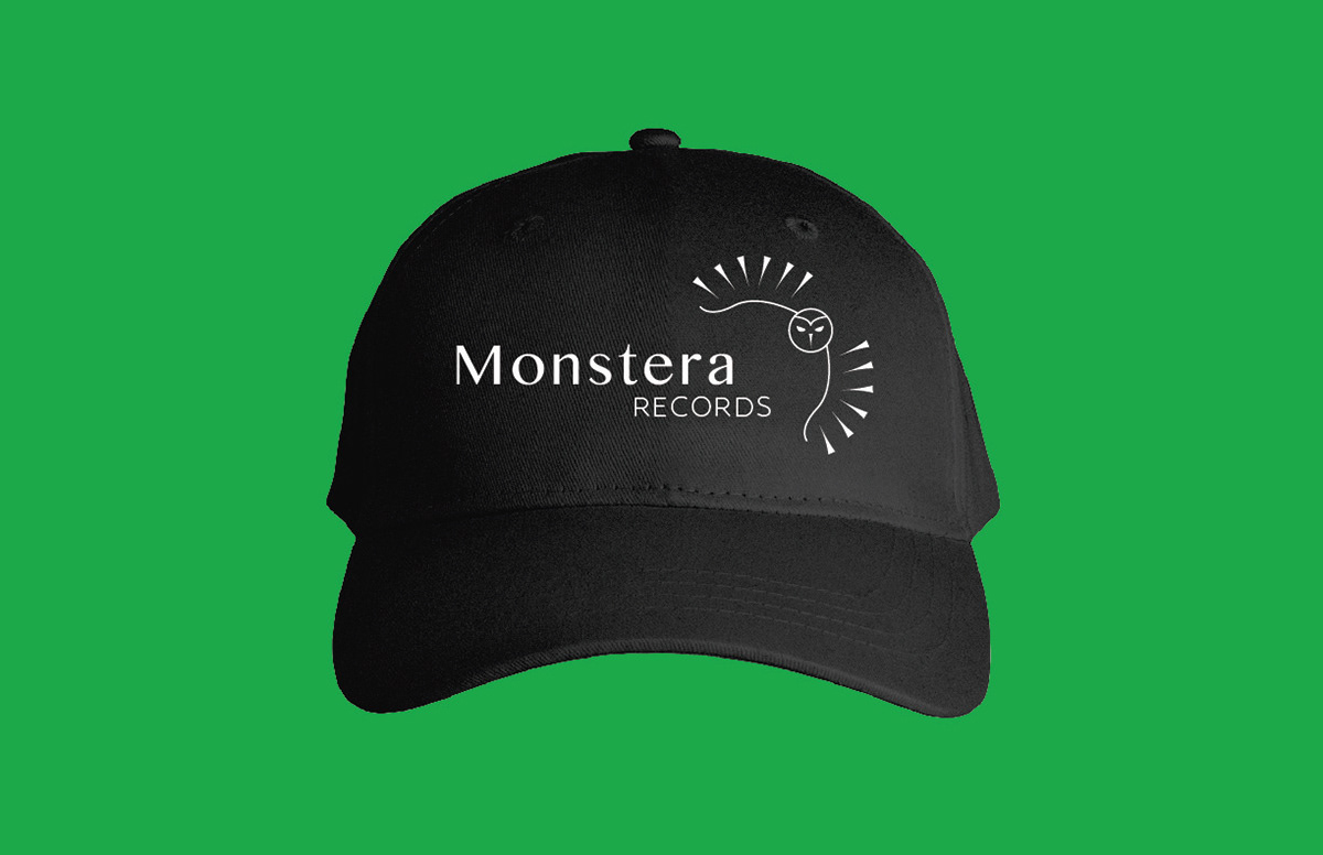
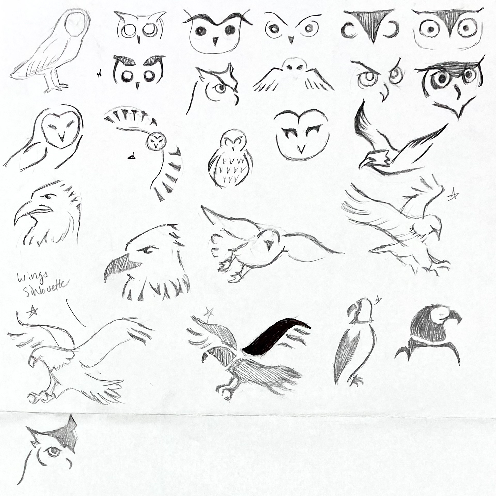
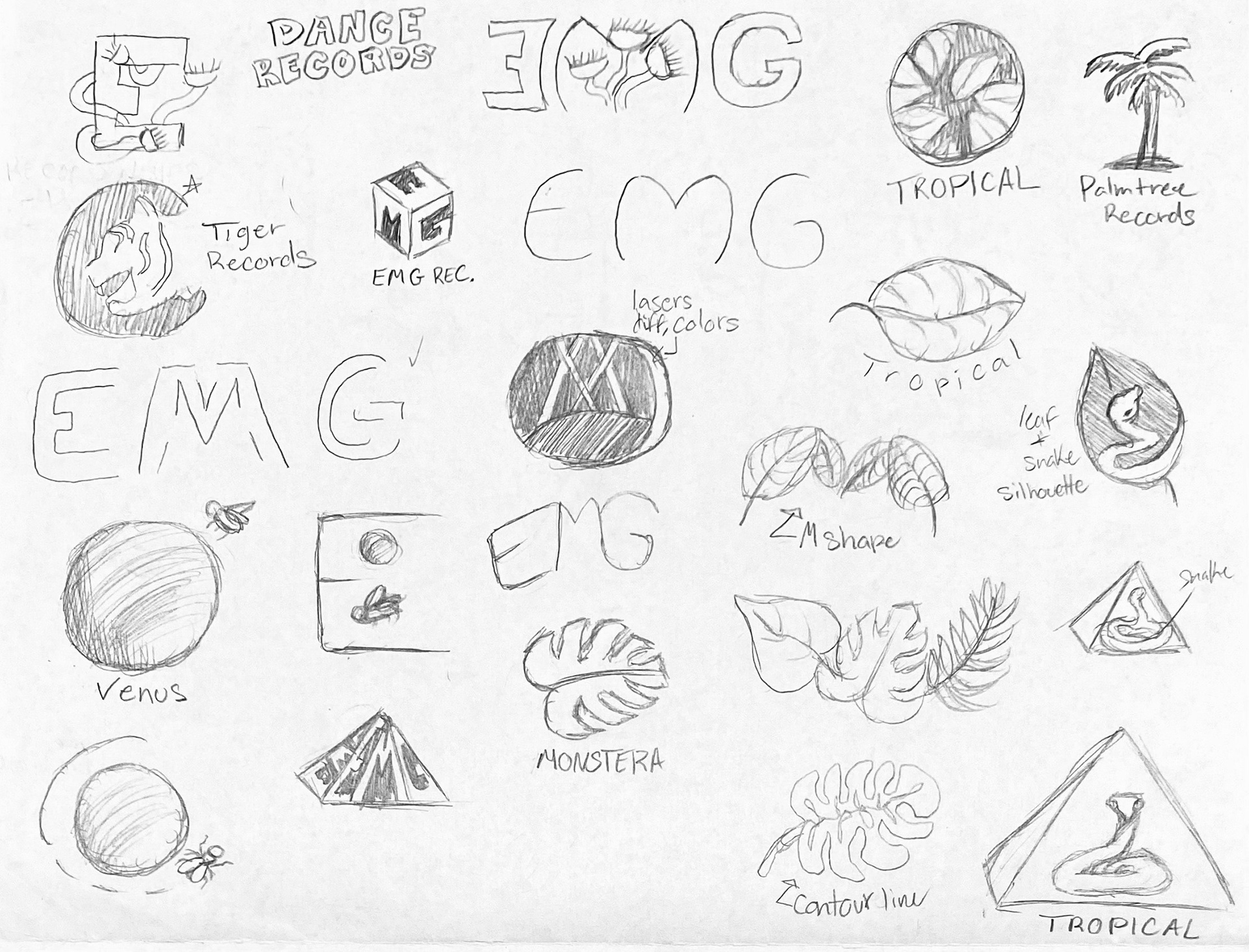
The second concept includes the client's interest of eagles and plants for the visual identity for my client. My client has mentioned appreciating the monster plant, which became the record label's name. Having both in one design was fitting as they relate to nature. An eagle taking flight also represents my client liking to go on adventures to explore nature.
Concept 3
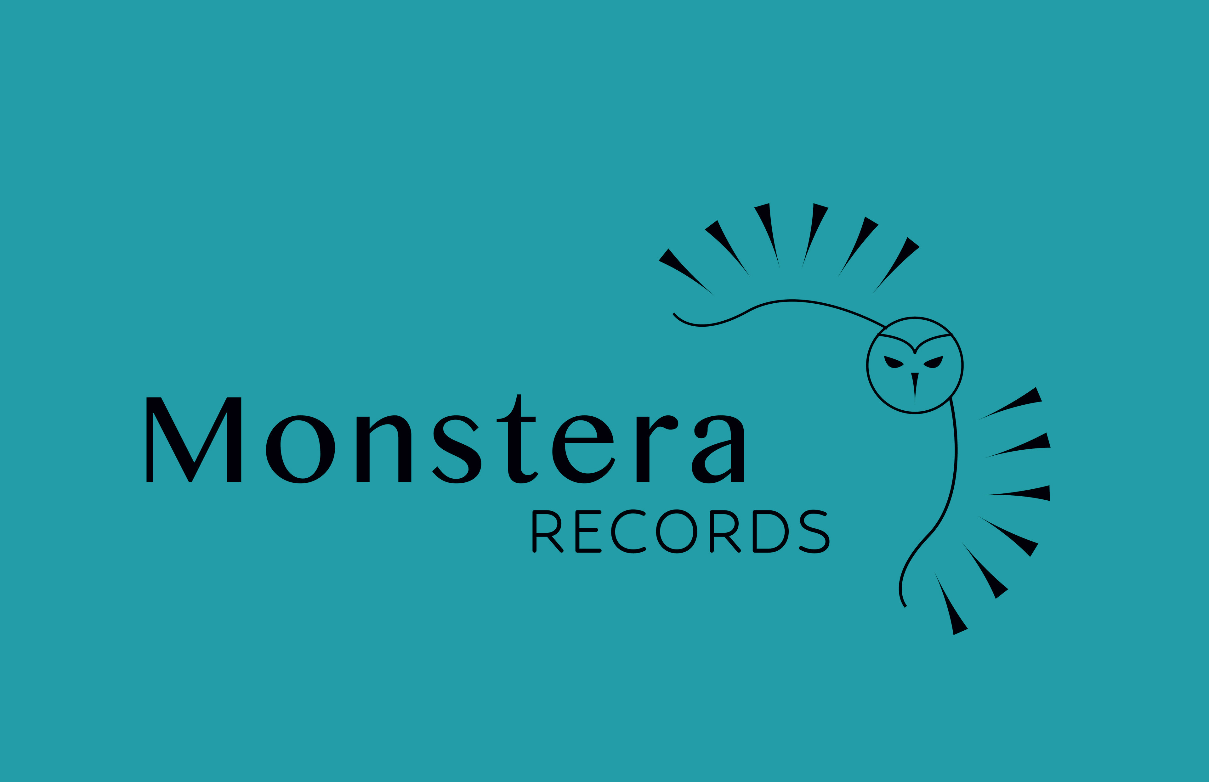
The third concept includes the interest of an owl and plants for the representational visual identity for my client. My client being fond of the monster plant, became the record label's name. I incorporated spikes for the exotic owl's wings span to stand fo the spikes that venus flytraps have. Even the typefaces I chose with the letter 'T' has a point that reminded me of the wing's spikes.
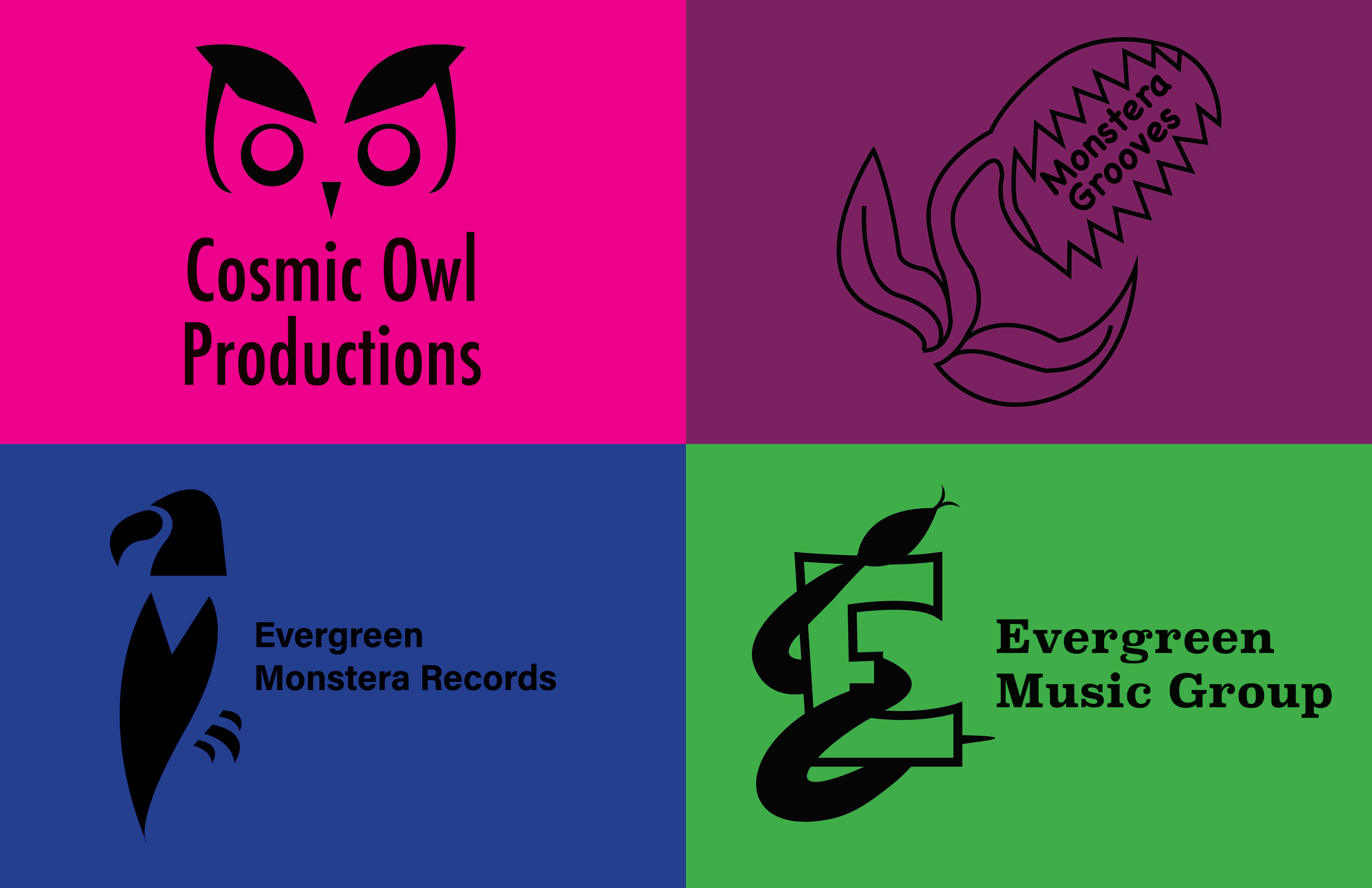
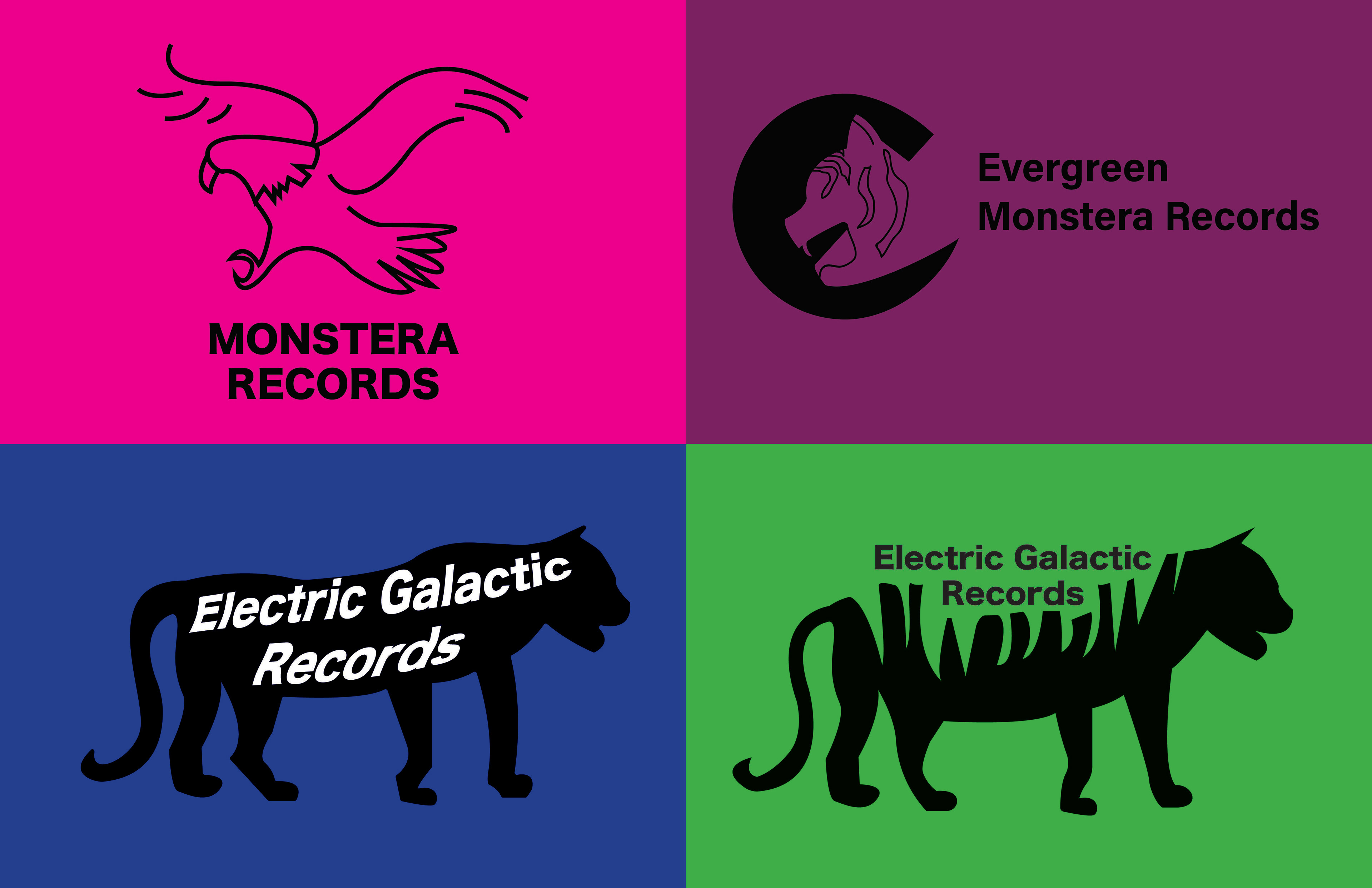
Unselected Logos
My Process
Stylescape 1
Stylescape 2

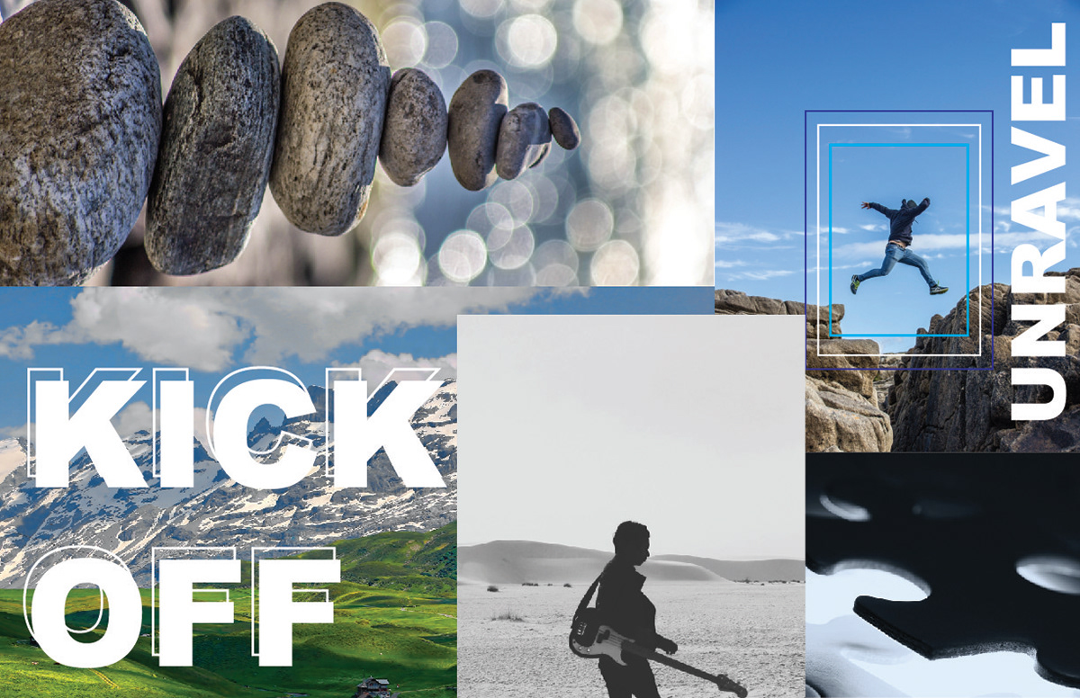
Album Covers


Logo Sketches
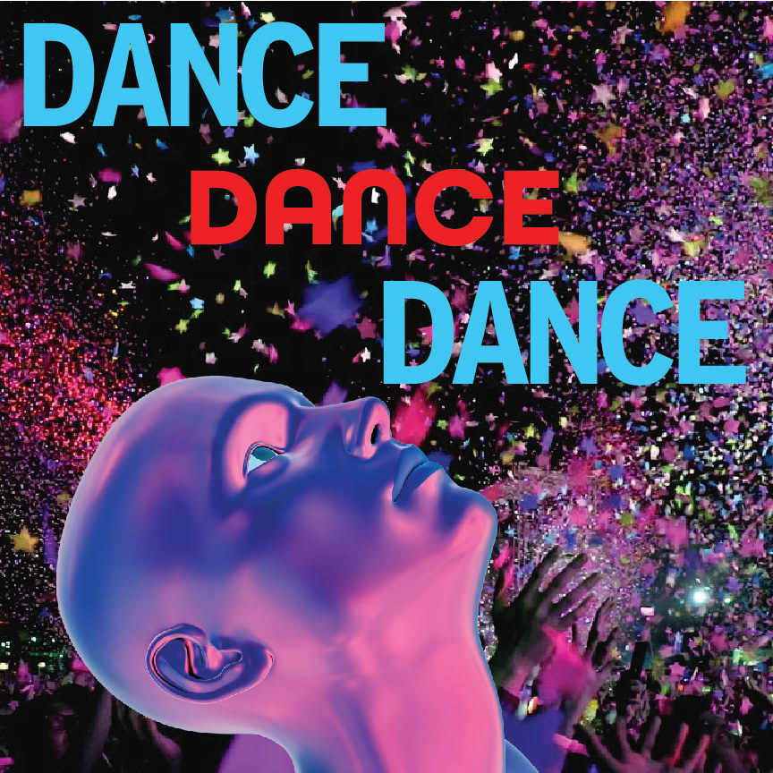
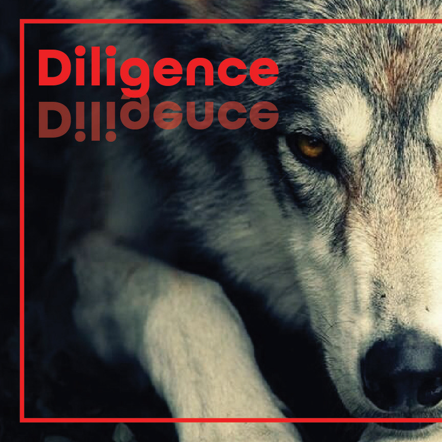
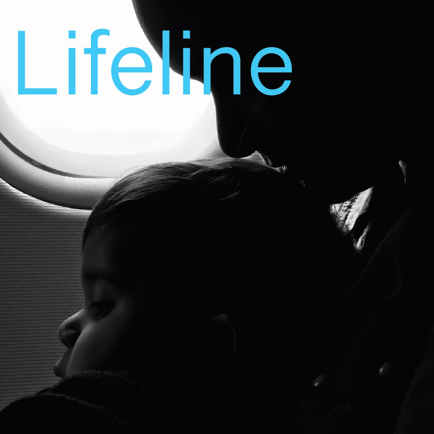
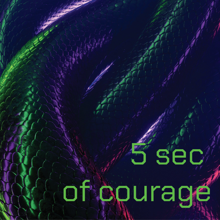
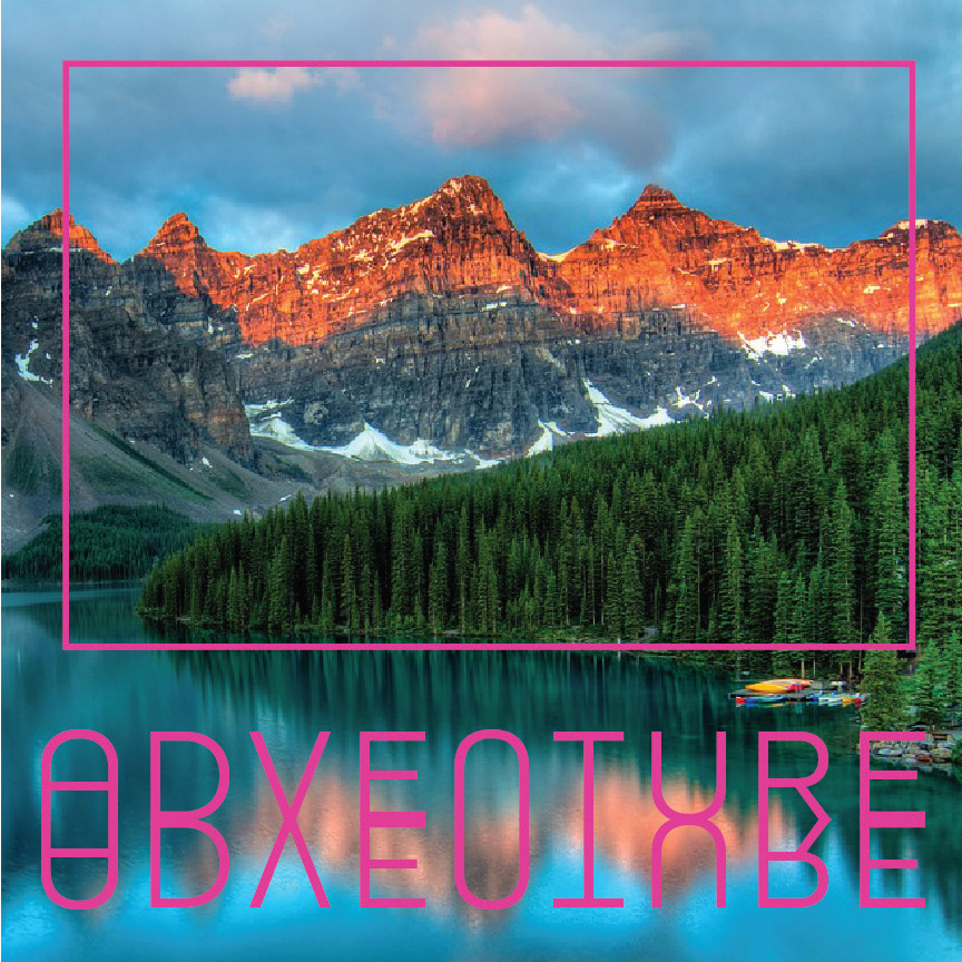
Five Album Covers Selected


Photoshoot

Final Thoughts
What did not work were the less simple logo designs. What did work based on the album cover sketches were the ones that had vibrant colors that my client liked. This project was enjoyable for me because album design is something I want to keep pursuing. It was interesting working with a client for the first time and figuring out how much input both parties have to design.